Offices with adequate space have to be utilized appropriately to ensure all the right facilities are in place. Arrivae highlights the importance of this aspect with contribution from expert.
Client Expectation: SAR Group Of Industries (Pune) wanted to design the advertising and back office for the fertilizer section of the 5,000 sq. ft. office.
Uniquely Yours Solution: Executed the project with unique design elements.
Architect Suraj Telang
What was the theme used for the advertising section in the office?
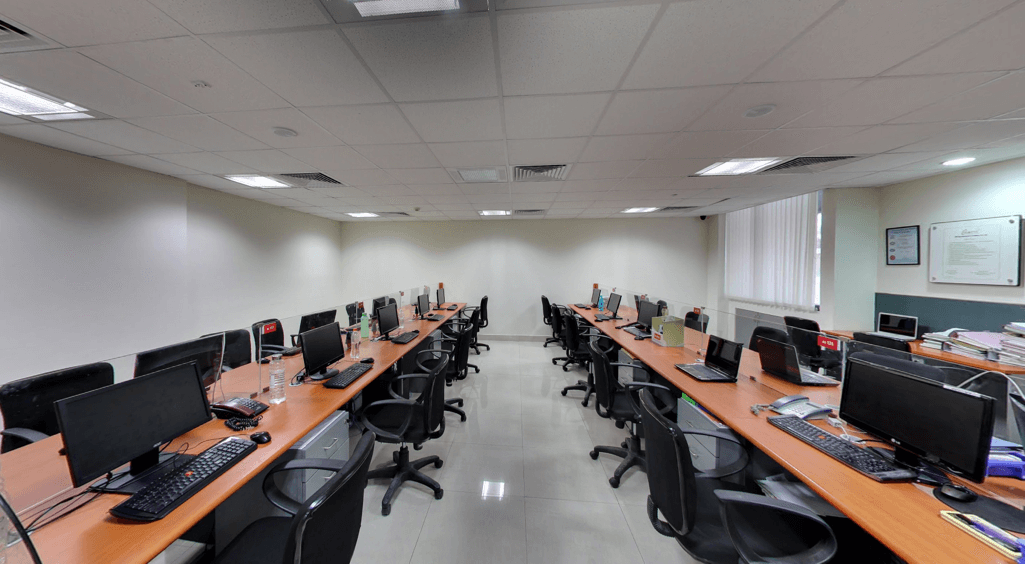
We designed the staff area for the advertising section in U shape where the seating arrangement was arranged facing the wall. The highlight of this section is that it can be transformed into a meeting area merely by moving the chairs around.
How did you ensure a spacious look and feel for the office?
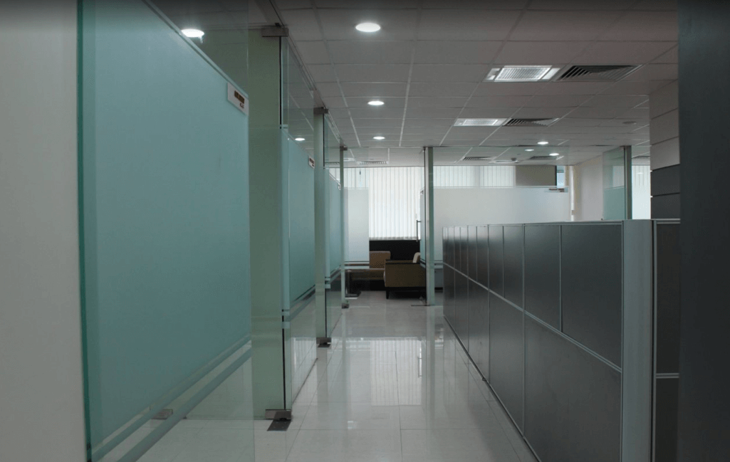
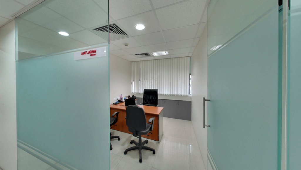
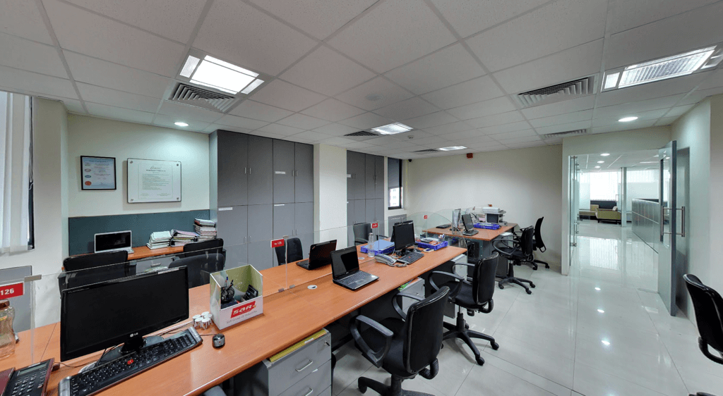
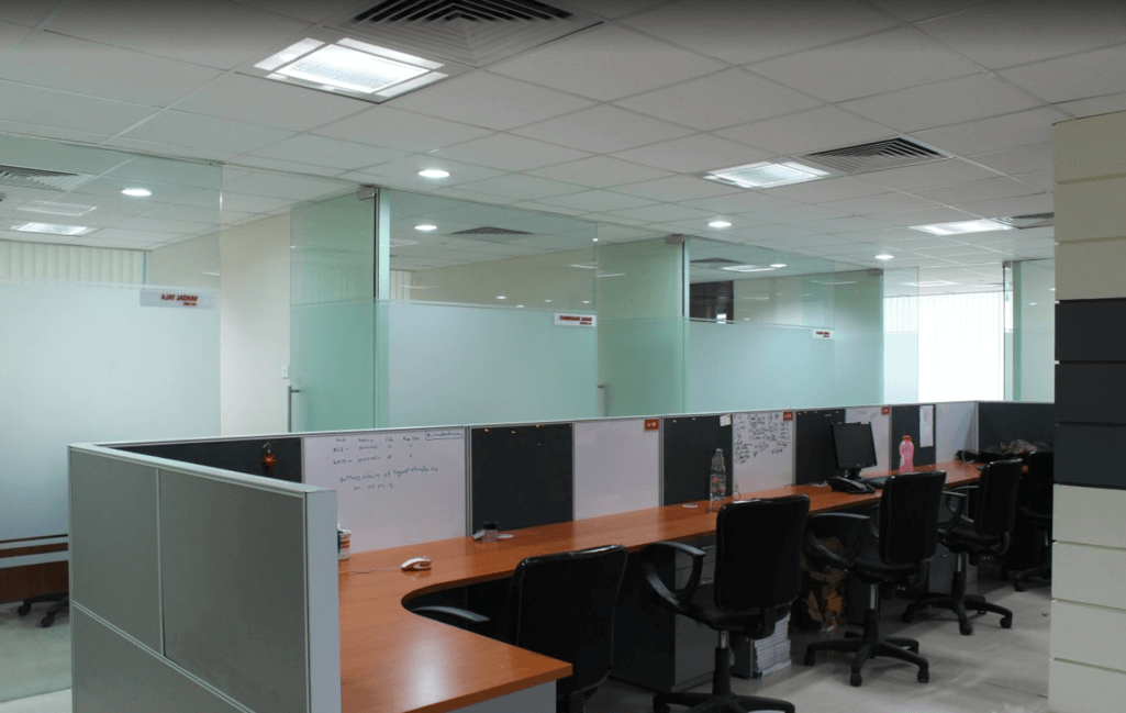
For the 5,000 sq. ft. office, the client desired 100 workstations, two meeting rooms, one boardroom to accommodate 12 people, cabins for directors, managers and accounts room. Overall, the client wanted a spacious look and feel. To cater to this requirement, we designed the entrance in such a way that when you enter the waiting area and stand in one corner, it looks spacious. We also pushed the cabins towards the wall and used glass for the entire façade to increase the volume of the space. As far as the colour scheme is concerned, we used maple wood hue for the table top and grey for the pedestal and white for walls. All these aspects contribute to adding volume to the office.
What was the design concept used for the back office section?
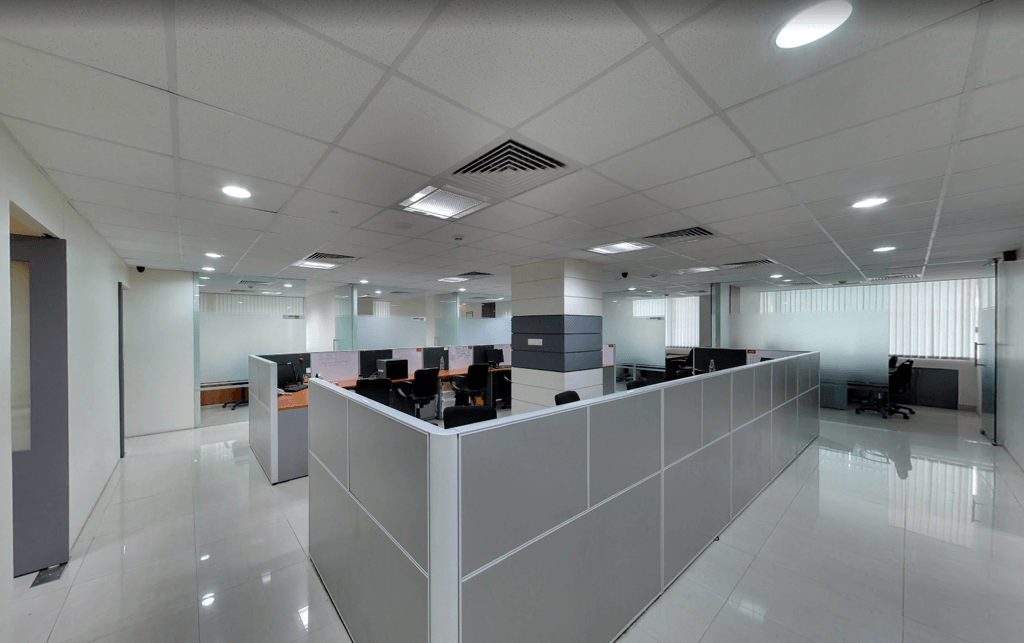
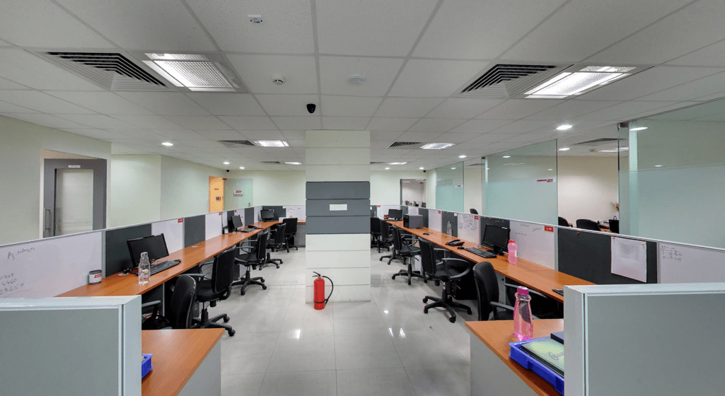
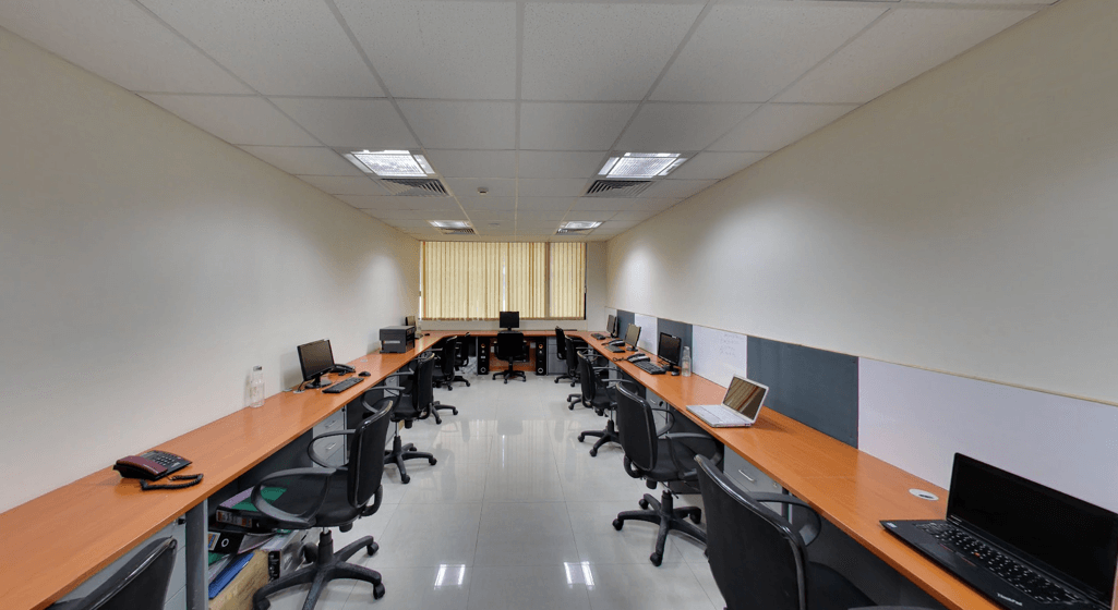
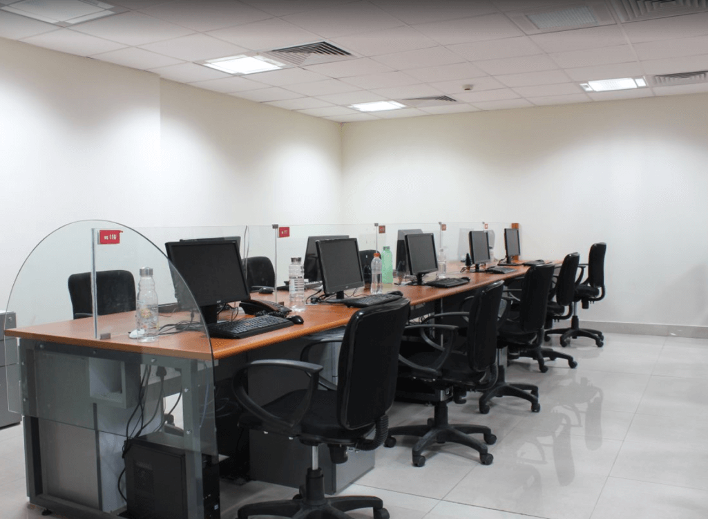
For the back office, we used a face to face desk system and intentionally stayed away from using too many partitions. This again contributes to giving the back office a spacious appearance. A 4ft by 4 ft table and glass partition on both sides enhances the look and feel of this section.
How did you take care of the storage aspect in this project?
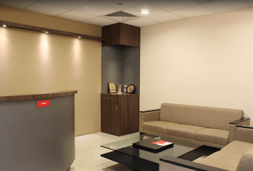
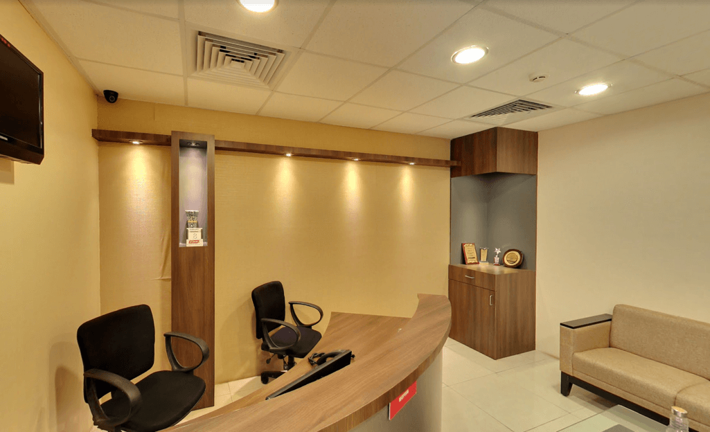
The client desired to place a Ganesha idol behind the reception area and a little bit of storage to display trophies. The back wall of the reception was utilized aesthetically for the same.
What was the plan for the reception, meeting and conference room?
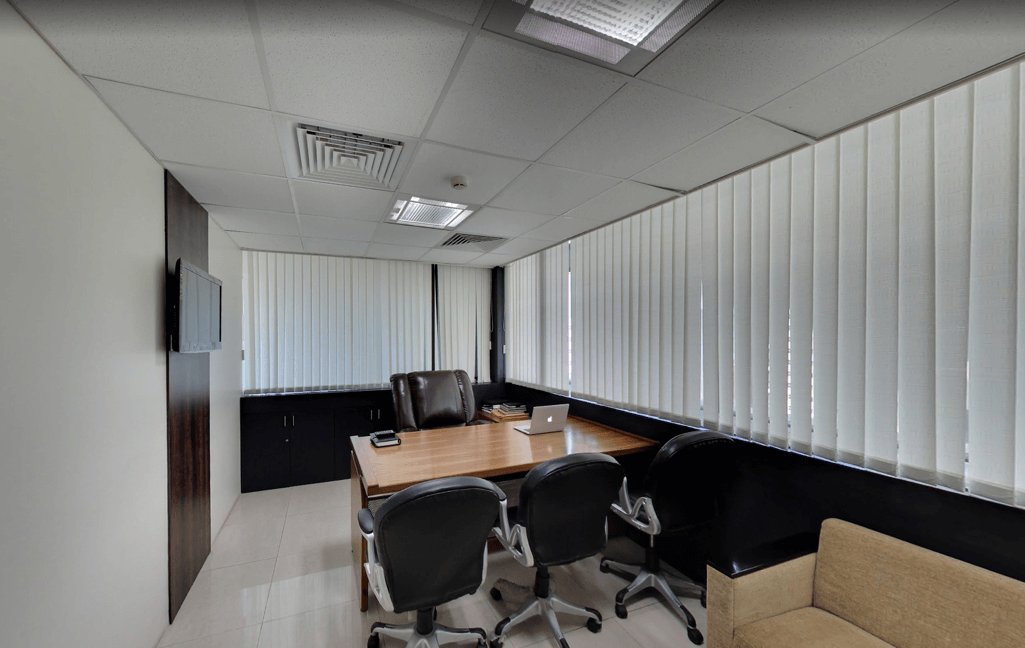
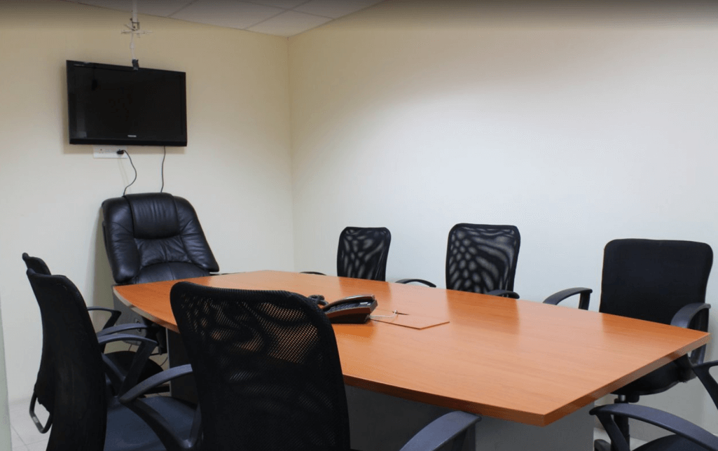
As the reception area was located at the corner of the office, we used a curve pattern with the waiting area facing the front portion of the reception area. A four seater round table in the meeting room and the conference room is equipped with video conferencing facility. On the other hand, the Director’s room has a lounge area and capacity to accommodate six to eight visitors and three seater accommodation. Being a Director’s cabin, this part is spacious compared to the other areas. The manager and accountants cabin has a simple look and feel as it had a restricted budget. The sober look was updated with enhancements like table with veneer and stainless steel finish.
Did you face any challenges while executing the project?
To manage and design the office within the budget set by the client was the only challenge faced. To overcome this challenge, we used gypsum partition as it is easy to install and maintain. Doors were fitted with floor spring. You will find few partitions used and modular storage enhances the office space further.
What was the functional aspect to be taken care of?
For the server room, we ensured that it did not exceed the length of the data wire and located it centrally for safety reasons.
