

Minimalistic design is all about creating a beautiful space with a warm and inviting feel. Focus on colours, shape and texture becomes a focal point in this theme. The concept has gained significant importance over the years, leading to more and more individuals opting for the minimalist approach. Characterized by simple and functional features, the minimalist theme is being embraced by homeowners and interior designers alike. Arrivae speaks to experts from the design fraternity to get their thoughts on the minimalist theme and the best ways to execute them in different layouts.
Designer Kalyani Kale, Blue Brick Design Studio
Client Expectation: Swati Rathi wanted a light and airy appearance in a 4 BHK house.
Uniquely Yours Solution: Opted for a basic colour scheme and stuck to using mostly white in the interiors. For the 4 BHK duplex, the minimalist theme was followed throughout with the light colour scheme to achieve a light and airy appearance. We experimented with the bathroom as this was a standalone space. The airy feel that the minimalist theme stands for was enhanced further with interesting marble work instead of tiles and lot of patterns, achieving the design goal of the client.
1. What was the design approach followed to use minimalist theme in the project?
As the minimalistic theme is dominated by white colour, the rest of the design elements were worked around it. White also ensured breathability to the space. We had to make sure that the materials used were synchronized. Since it was an old construction, the walls had to be clad in metal sheet that was later plastered and staircase had to be reconstructed and cantilevered on a central beam. Keeping the minimalist theme in mind, few colours were used here. On the upper level, mirror was used near the entrance of the master bedroom to open up the space and give it an airy appearance.
2. Did you face any major challenge using the basic colour scheme?
We felt using the white colour scheme throughout would give a boring and monotonous feel to the interiors. We made an effort to convince the client, Swathi Rathi, to add tinge of colours wherever possible. She agreed to use light colours like cream and few other shades for the upholstery. Colour was introduced for the bed back panel with pale mint green fabric. Similarly, the console was custom made with white lacquer and high gloss stainless steel sheet.
3. What kind of décor did you use for this project?
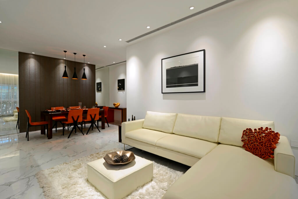
Since the theme lays emphasis on the use of minimum décor elements, you will find mirror with veneer and copper finish used here. The pooja room situated in the living area was also decked up with inlay work. Black and white marquetry in chevron pattern in the bathroom is one such element that grabs attention in the minimalist interiors. In the living area, windows have a portal finish in black and white and grey Corian work finished with copper hanging lamps
4. How did you deck up the daughter’s and son’s room with the minimalist theme?
We continued the white colour story in the teenage daughter’s room with one wall clad in brick pattern, wardrobe in white lacquer finish with relief pattern and marble in the bathroom. A floral curtain used here makes a statement and reiterates the less is more approach that the minimalist theme stands for. For the son’s room with the study area, we used a combination of yellow with white. Ochre yellow was used on the study cabinet shutters and bed back wall, and bathroom with grey and white marble was used near the dresser area.
Mukta, Notion Design Studio
Client Expectation: Mughda Pendse desired a user-friendly space with maximum storage, very minimal design and fresh theme for living and bedroom.
Uniquely Yours Solution: Minimalism is all about giving a timeless feel to the interiors. We set a benchmark with few colours and introduced liveliness with yellow, blue and tinge of black for MS members in the living room and continued with the same colour story throughout the house. Grey was introduced in the bedroom to break monotony. This colour gave a cool touch to the interiors, emphasizing on the minimalist theme.
How did you manage to create visual interest with the minimalist theme?
As the concept is all about cutting on decorations and using few elements, we used wooden furniture in the house to create a sense of warmth. To add aesthetic touches to the 3 BHK house, we picked few handles with wooden colours and added grooves in the laminate.
Tell us about the unique elements used in the kid’s room?
For the one-year-old kid’s bedroom who loved cars, we designed the wardrobe with the car theme against the blue colour background.
What was the colour scheme followed throughout the house?
Adding one bright colour adds attention to the minimalist theme and keeps it from giving out an overbearing appeal. To avoid the clash of colours, we used bed back wall with a fabric finish and grey colour with brown laminate and tinge of yellow and blue in the second bedroom. For the third bedroom, we plan to use wallpaper in shades of magenta yellow.
Did you face any major challenge during the execution of the project?
We had different thoughts to design the 3 BHK house with different themes, designs, patterns considering the expansive space, but Mughda Pendse was not convinced with using any other theme and requested for a simple and decent look.
Shami Goregaoker, Design Director and Colour Consultant, GA design
Client Expectation: To achieve better design through simplicity.
Uniquely Yours Solution: A simple, straightforward efficient layout, with lot of open spaces that allow access to natural light and ventilation. The emphasis is on utilizing the space in its original form and keeping it clutter-free.
What would be your approach while using the minimalist theme?
The minimalist theme can be achieved through simplicity – in design, form and materials. The focus should be on handful elements with soft or neutral colour schemes and comfortable layouts. Therefore, we should utilize the space in its original form and keep it clutter-free. This theme has a calm and inviting appeal and is relatively easy to maintain as it is almost fuss-free. Spacious rooms with ample natural light and uncluttered aesthetics are typical of minimalist interiors.
How would you highlight the minimalist theme in a living, kitchen and games room?
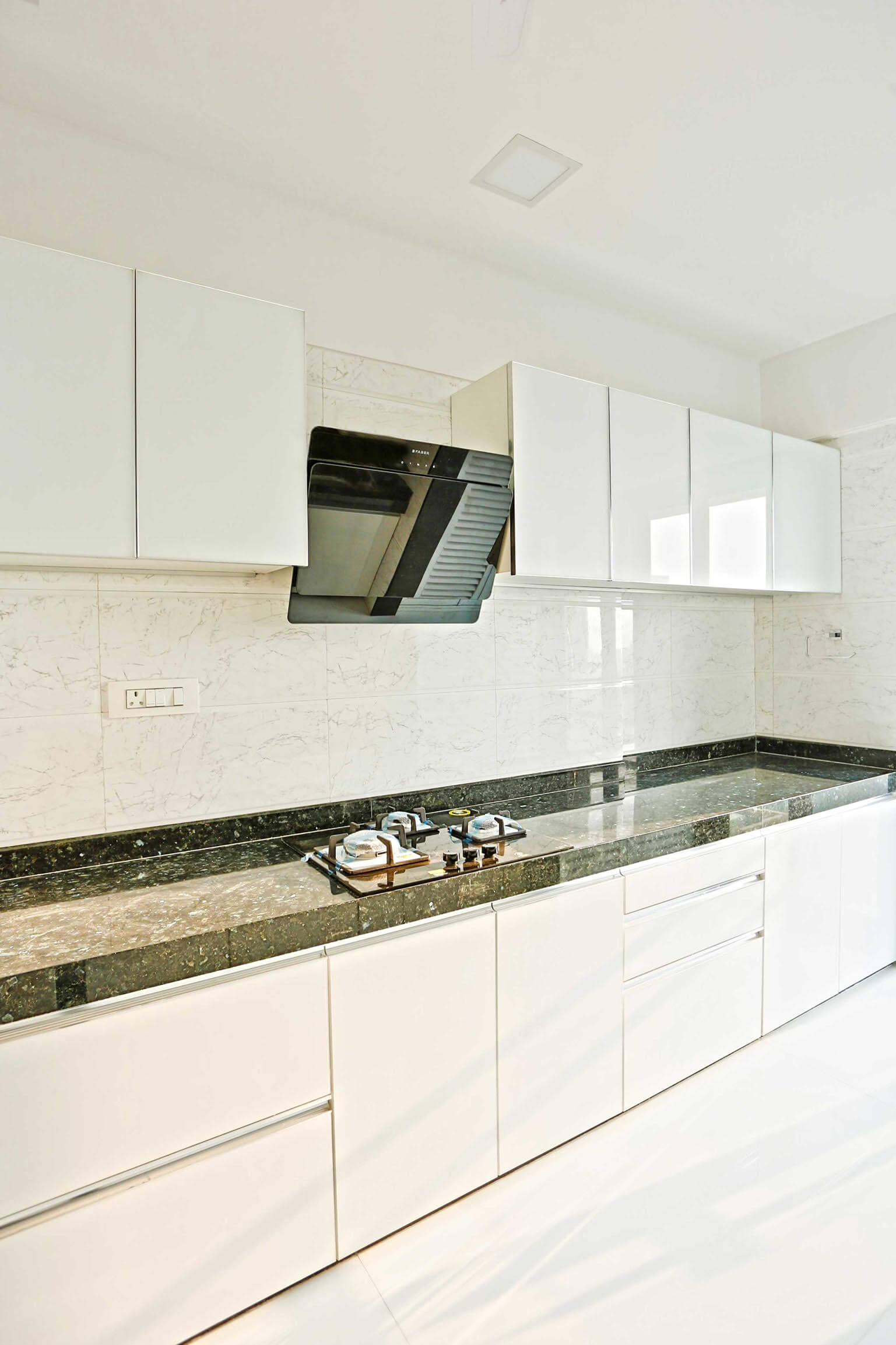
While designing a living room with this theme, we would choose a neutral colour palette with a subtle colour pop, keep furniture designs simple, stylish and in straight lines. We would not overuse texture. The reason being, a lot of contrasting textures can clash and give out an unpleasant feel. In kitchens, the cabinets are simple, devoid of paneling or moulding. Cabinet finishes should be kept simple and easy to maintain, and every item and gadget should have a designated place. Similarly, the counter should be left uncluttered and the flooring should have a subtle feel. For games rooms and children’s rooms, the principal remains the same – use natural ventilation and light. Keep original window openings untouched and don’t try and block any natural light.
Architect Mangesh Jadhav
Client Expectation: Jaydeep Patankar emphasized on low maintenance for his 2 BHK bungalow.
Uniquely Yours Solution: For durability reasons, stone was used instead of wood. Ferrow cement and cast on site furniture was also used in this project. The aim was to make the space look as big as possible in an open layout. The unusual combination of rustic feel on the exteriors and minimalist approach followed in the interiors satisfies the creative appeal desired by the client.
Could you elaborate on the concept used in the project?
The thought process used in this project was based on views. Since the project comprised of rectangular shape room with three sides, where the short rectangle room gave access to views from the backyard and the big rectangle views to the field, we tilted the house to 45 degrees to get the best outdoor views from the house.
What is the main highlight of this project?
Rectangular shape rooms with four walls were the highlight here. To open up the space, we removed two walls from the living room, kept two walls and used sliding doors so that the client could access beautiful views to the verandah from the house. This feature was used between the verandah and living to ensure connectivity between indoors and outdoors.

Could you throw some light on the unique features used in the project?
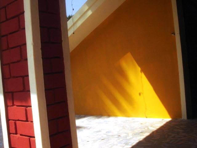
We used minimum passage space and opened up the lobbies. The minimalistic theme was enhanced using cost-effective features like exposed brick work on the wall. Rat trap bond on brick work was also used. Low-height wall camouflages the entry of the bedroom from the living, giving it an aesthetic touch.
Architect Manan Gala
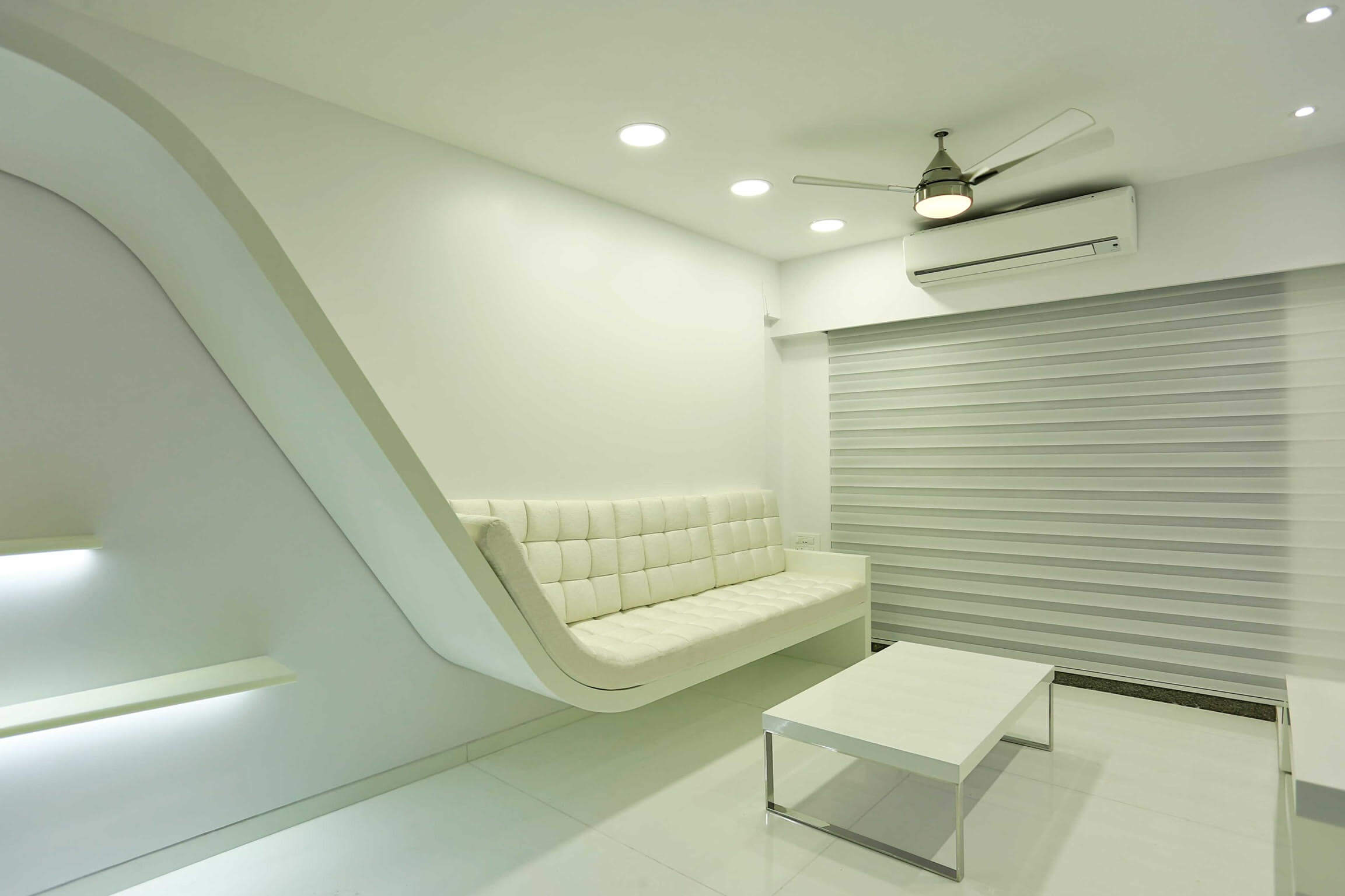
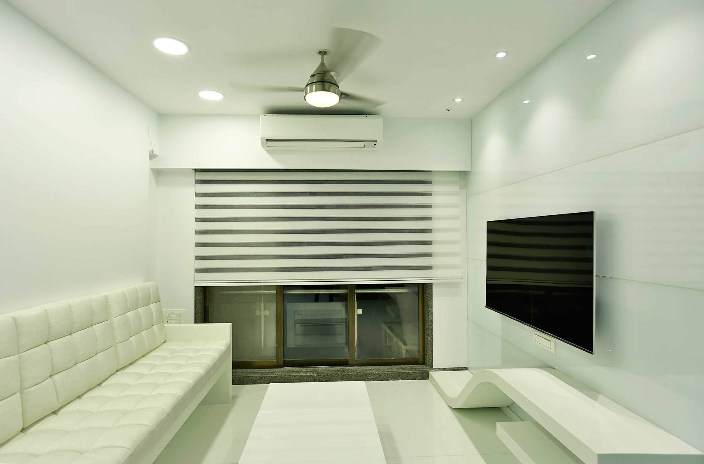
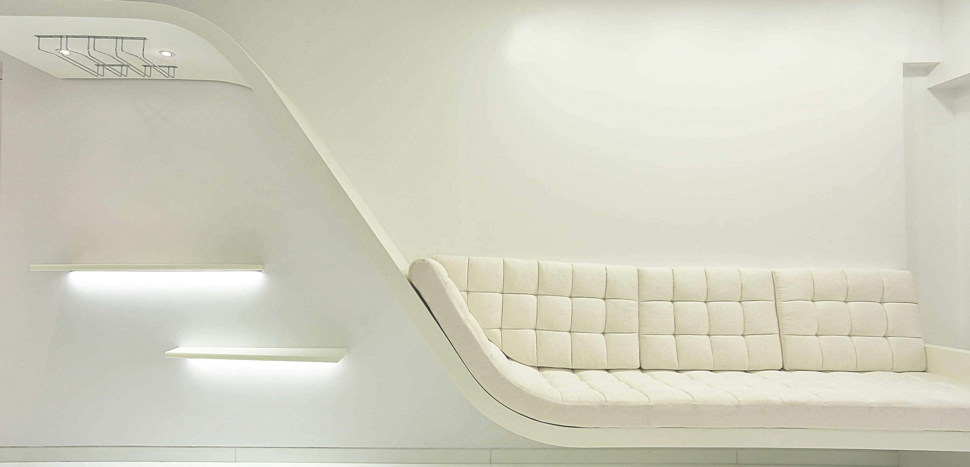
Client Expectation: Loved white colour and wanted it to be used generously in the 2 BHK apartment comprising of 780 sq. ft. area.
Uniquely Yours Solution: Ensured that no other colour was used in the living area. To achieve a light and airy appearance, the materials used were also in white. To adhere to the minimalist theme, you will not find any loose or added furniture around the space. Furniture was specially fabricated to blend into smooth surfaces. Walk in wardrobe is another aspect that reiterates the minimalist theme in this interior.
What is the functionality behind using the minimalistic theme?
The minimalist theme strives to achieve a neat and clean design. As far as colours are concerned, light colours or basic white or one or two contrasting colours can be used for the theme. This functionality stands true for furniture as well with straight lines and no confusing functions.
How did you add glamour to the project considering the client’s eagerness to use only white?
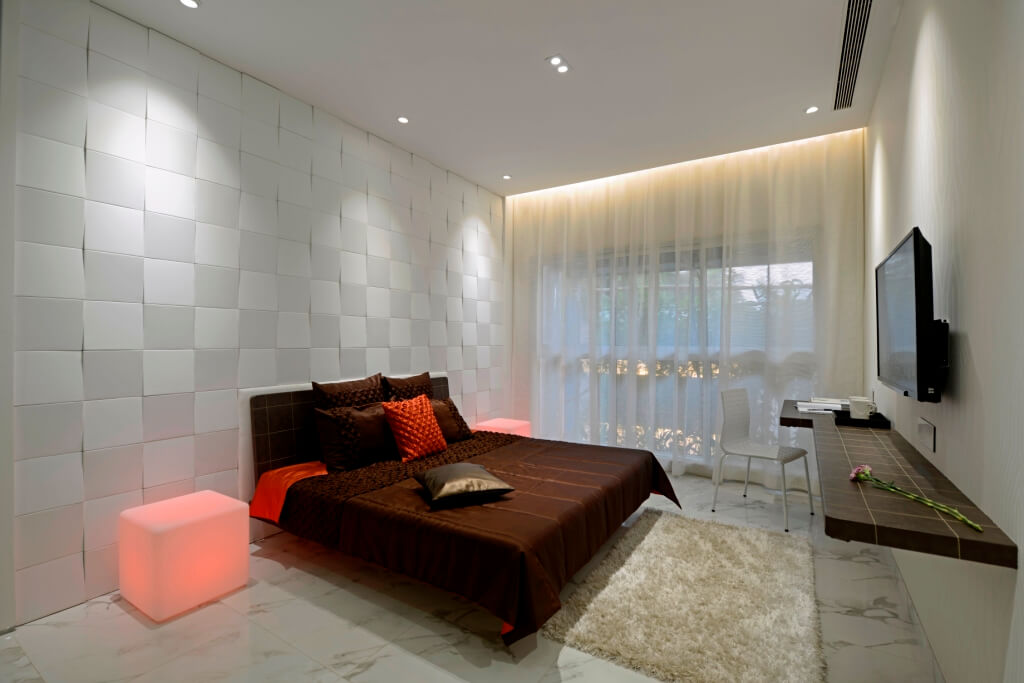
The bed was molded out of white colour Corian. We used lights on three sides near the border. The colour of the lights could be changed according to the mood of the user with the help of a remote control. The only challenge here was to achieve clean and smooth appearance from the material.
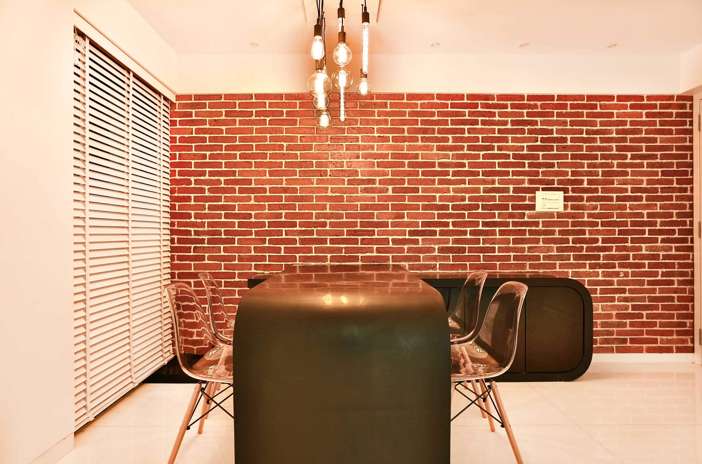
Would you like to talk about any specific element used in the project?
Exposed brick wall used in the dining area and black colour Corian table and transparent acrylic chairs for the dining breaks the monotony in the dining area.