Interiors with positive energy leave a tranquil impact on its inhabitants. Arrivae gets in touch with expert to track the process required to emit positive vibe throughout the space.
Delna Shaikh
Client Expectation: Mrs. Anaitha Deboo desired interiors with modern theme and light colour scheme.
Uniquely Yours Solution: Executed the project with modern theme catering to the requirements of the client.
How did you ensure to emit positive energy in Mrs. Anaitha Deboo’s project?
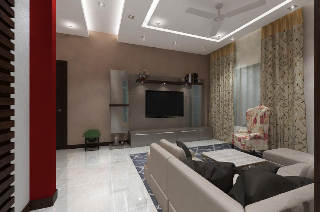
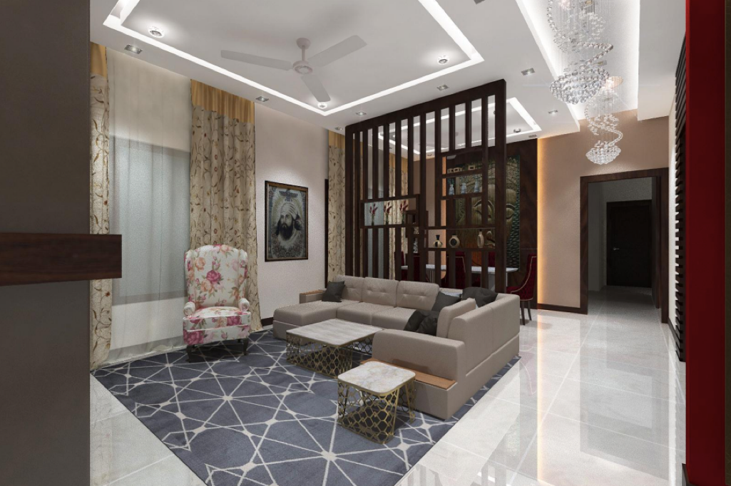
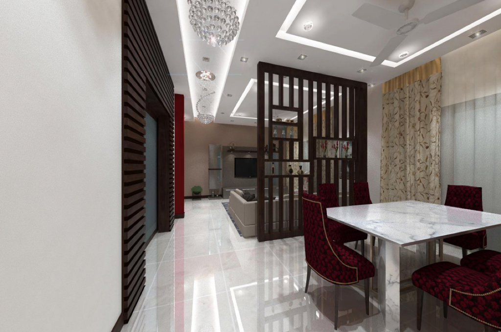
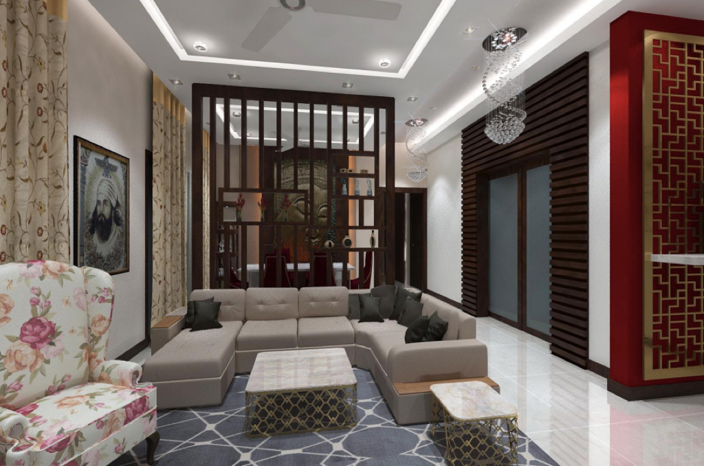
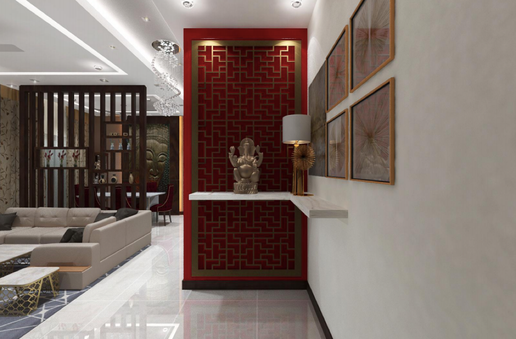
For the 3BHK project, Mrs. Anaitha Deboo wanted a space that depicted positive energy. A spiritual person by nature, she believed in the positive vibes emitted by feng shui, Buddha and Lord Ganesha. For this reason, we created a shelf near the entrance to place a Ganesha idol. Sitting pretty on a red background in metallic finish, this shelf emits a sense of tranquillity to the space. Another feature that adds an element of serenity here is the big Buddha frame with vertical batten in high end laminate in the living area. Adhering to the instructions of Mrs. Deboo, we made a big MDF frame in metallic finish. The washable feature of this laminate is the main highlight of this space. Yellow warm lights and back lit feature gives a nice accent to the space. A 2.5 metre Buddha image was placed using the rustic theme for the panel.
What theme did you follow in this project?
To adhere to Mrs. Deboo’s requirements, we gave a modern look and feel to the space. The client had won the coveted title of Diva Mrs. Pune for the year 2017. Therefore we wanted to give the space a modern appearance to adhere to her status and interest. Mrs. Deboo was fond of reading books. So we created a book shelf to cater to this hobby.
On the left hand side of the living area, we created a showcase to place the television unit. To segregate the living from the dining area aesthetically, we have used wooden veneer partition. To display small artefacts, we have given horizontal and vertical battens in the living area.
How did you enhance the guest bedroom and master bedroom in this project?
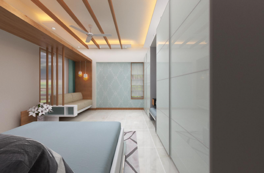
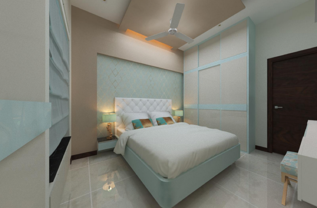
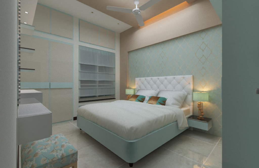
We kept the colour scheme light with turquoise light blue and light brown scheme. The bed back wall has been decked up in leather. Hidden storage given under the bed adds visual interest. Wallpaper with groove panelling and dressing unit highlights the television wall beautifully apart from full height hydraulic wardrobe. Light brown colour scheme has been continued on the ceiling in the guest bedroom.
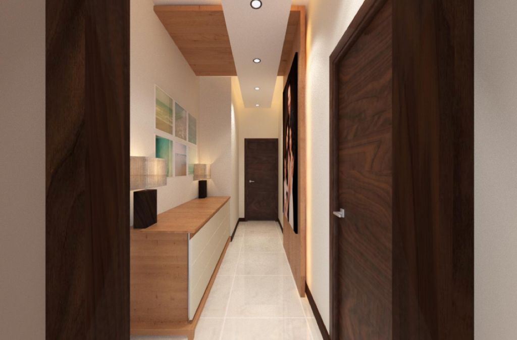
In the master bedroom, there is a bed that is a little bigger in size than a king size bed. There is leather panelling on the headboard. The colour scheme is again turquoise blue wallpaper on the window side. White leather finish has been used in the master bedroom. Here, we have given a plank that starts from the bed and continues on the opposite wall, creating a hanging like seating appearance with a hidden feature. Low height storage has been provided near the passage leading towards the bedroom that has been highlighted with full height back lit panel. A happy family picture adds a personal touch to the passage area.
Would you like to talk about any unique feature in the master bedroom?
Division of sections for the wardrobe has been done in such a way that the central unit is dedicated for men’s clothes and accessories. Then we have given storage behind the mirror followed by wardrobe space for the female. The design of the wardrobe has been executed in such a way that all the sections appear to be as one single unit. We also designed the interiors of 7 ft. height wardrobe.
To accommodate the necessities of the celebrity’s family, we have given a separate slot for men’s blazers. There are locker units and drawers with glass given apart from trolleys to store miscellaneous items. In the female section, we gave one slot to accommodate the client’s full length gown. For accessories, there are few shelves in different sizes and glass drawers.
The celebrity client was extremely fond of shoes and had a good collection to display. A full height of 2.4 metres shoe cabinet was provided to accommodate this huge collection of shoes. In the dressing area, there are chairs in SS finish with upholstered cushions. With mirror finish given for the entire dressing unit, there is storage provided for accessories behind the mirror. In the bath area, there was no bathtub. So we created one. The glass and cabinets were already provided by the builder.
Did you face any challenges while executing the project?
We faced minor issues with reference to sizes. Polish was another obstacle we overcame. While doing veneer, we had to use polish finish. Problem with laminate is another challenge we faced. In spite of all these challenges, we were able to execute the project in one and a half months instead of the two month deadline given to us.
The interiors of the wardrobe were not part of the initial discussion. The client desired to have the interiors of the wardrobe done too. We did our part to convince them about the different sections to be given for the wardrobe. Fabricating a site with four pillars was extremely difficult. The bed with its floating appearance was also a last minute thing to be done. This was possible as the wall was not strong. We also gave an L shape support on the wall.
What was the client’s reaction to the end result?
The client was very happy with the end result but a little possessive about the project as she wouldn’t permit us to click pictures of the project. We gave the colour combination to the client and they took the decision to use them.

