Kids grow fast and this aspect prompts to style their space with a flexible design. Arrivae charts out the areas that can be modified in such a way that it can cater to the growing requirements of the kid.
Client Expectation: Mr. Khaitan (Wadala) desired a lot of storage to accommodate toys and accessories for their two-year old daughter.
Uniquely Yours Solution: Executed the kid’s room design with feminine colour scheme and adequate storage.
Architect Abhay Patil
What was the different storage options provided to cater to the needs of the kid’s room?
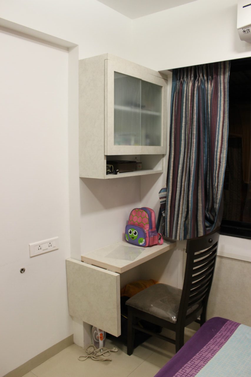
To fulfill the requirements of Mr. Khaitan’s two year old daughter, we designed a lot of storage to accommodate school books, toys etc. Part of the storage was open and few were closed so that storage material can be stored in here.

Could you tell us about the specific elements used in the kid’s area that make the space stand apart?
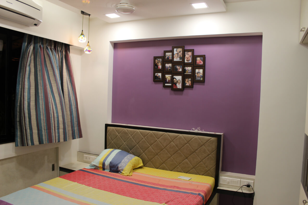
The main highlight of the kid’s room is the colour scheme. Considering the fact that the space would be occupied by a two-year old, we used basic white colour and highlighted the space with a combination of pink and purple hues.

What kind of furniture have you added in the kid’s room?
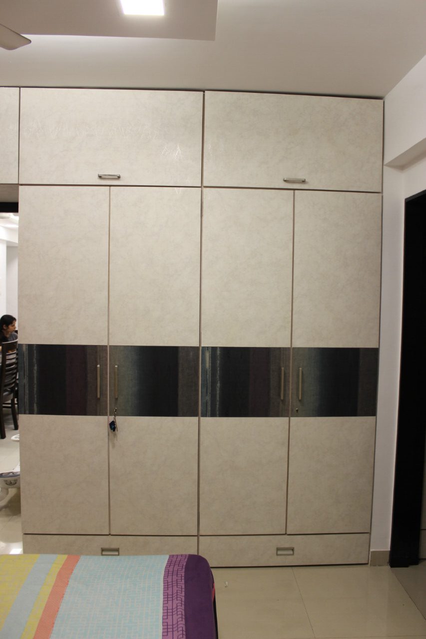
We placed a normal wardrobe because it would be used by the parents and kid. Loose furniture like small study table and small study chairs were provided so that the kid could be comfortable in the space.

What were the functional elements to be kept in mind while designing a kid’s room?
Kids grow very fast and therefore we had to look at a futuristic design for the kid’s space. This aspect is very important as we don’t want the space or furniture to be wasted once the kid grows up. Too many modifications can spoil the aesthetics of a space. Flexible design is the answer to this. We designed the furniture like wardrobe and storage with flexible features so that it can be used easily 7 – 8 years down the line as well. Since the space was going to be accommodated for a child, we took care that there were no sharp edges for the furniture.

Could you specify the décor elements used in this space?
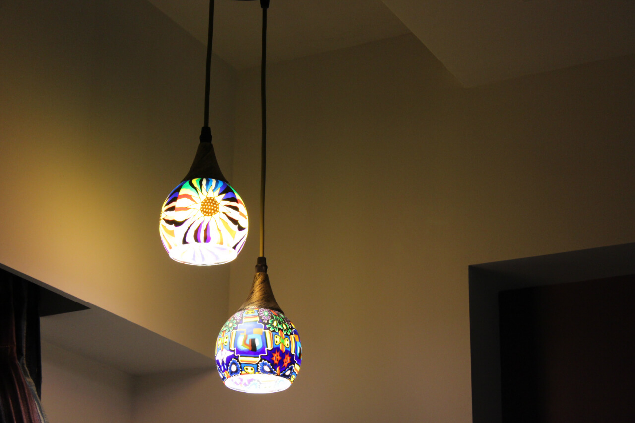
We have a combination of direct and task lighting used in the kid’s area. Cove lights and nice mood lighting have been given in the space to complement bright colours like pink and purple used in the room. Appropriate furnishings like sheer and solid curtains were given here. We normally give two channels to accommodate sheer and solid curtains. This adds a decorative touch to the space. A combination of bright colours was used for laminates on the wardrobe. This gave a mix and match feeling to the space. Wall highlights and glass soft board to enhance the creativity of the child had the feature to sketch on and wipe it off. Colour was the connecting element that was continued throughout the space. We created an accent wall behind the bed and decorated it with lot of family pictures shortlisted by the Khaitan family.

