Play of colours form a focal point in a kid’s room. Arrivae speaks to expert to explore the style that can be achieved with the right mix of colours and storage.
Architect Prajakta Shirgaonkar
Client Expectation: Ankur Bhajanka desired a bedroom cum play area for his one and a half year old daughter with play of colours and some storage in the bedroom and section for toys and did not want any beds as the kid was small and would be sleeping with the parents for another one or two years.
Uniquely Yours Solution: Used colours in the room and made sections for storage.
How did you execute the kid’s room keeping in mind the client’s inputs?
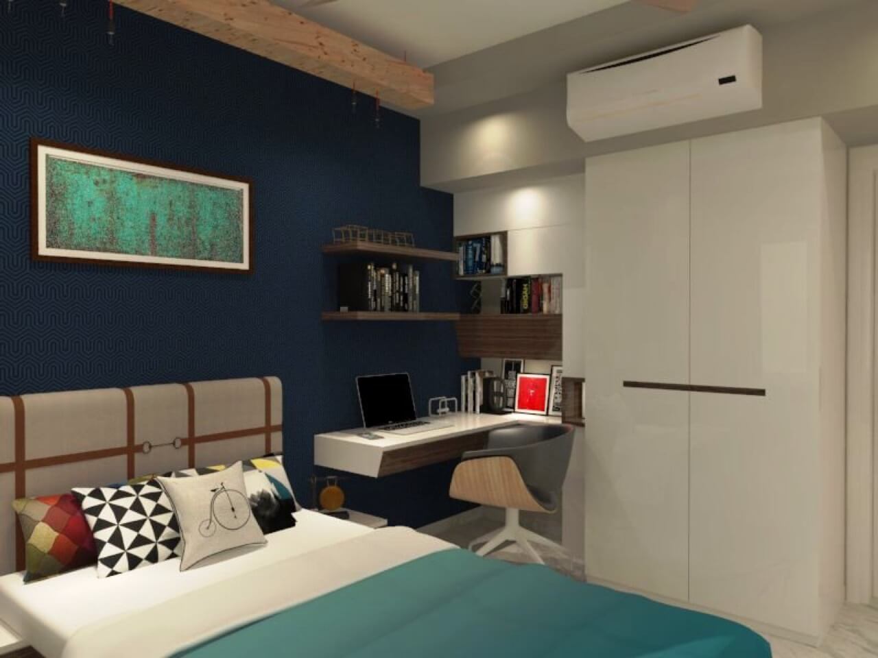
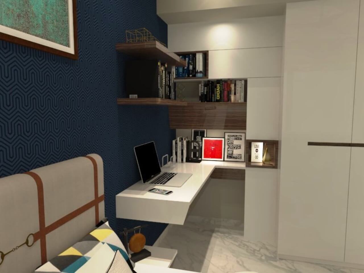
We used different colours like blue, yellow and orange throughout the space. For storage, we divided the wardrobe into different sections specifically for toys. To add a colourful touch to the kid’s area, we gave few open shelves in yellow for display purpose and added few closed shelves with shutters to accommodate toys. Different colour theme was used for the shutters. The flooring and ceiling was not touched and kept as it was provided by the builder.
What was the main highlight of the kid’s room?
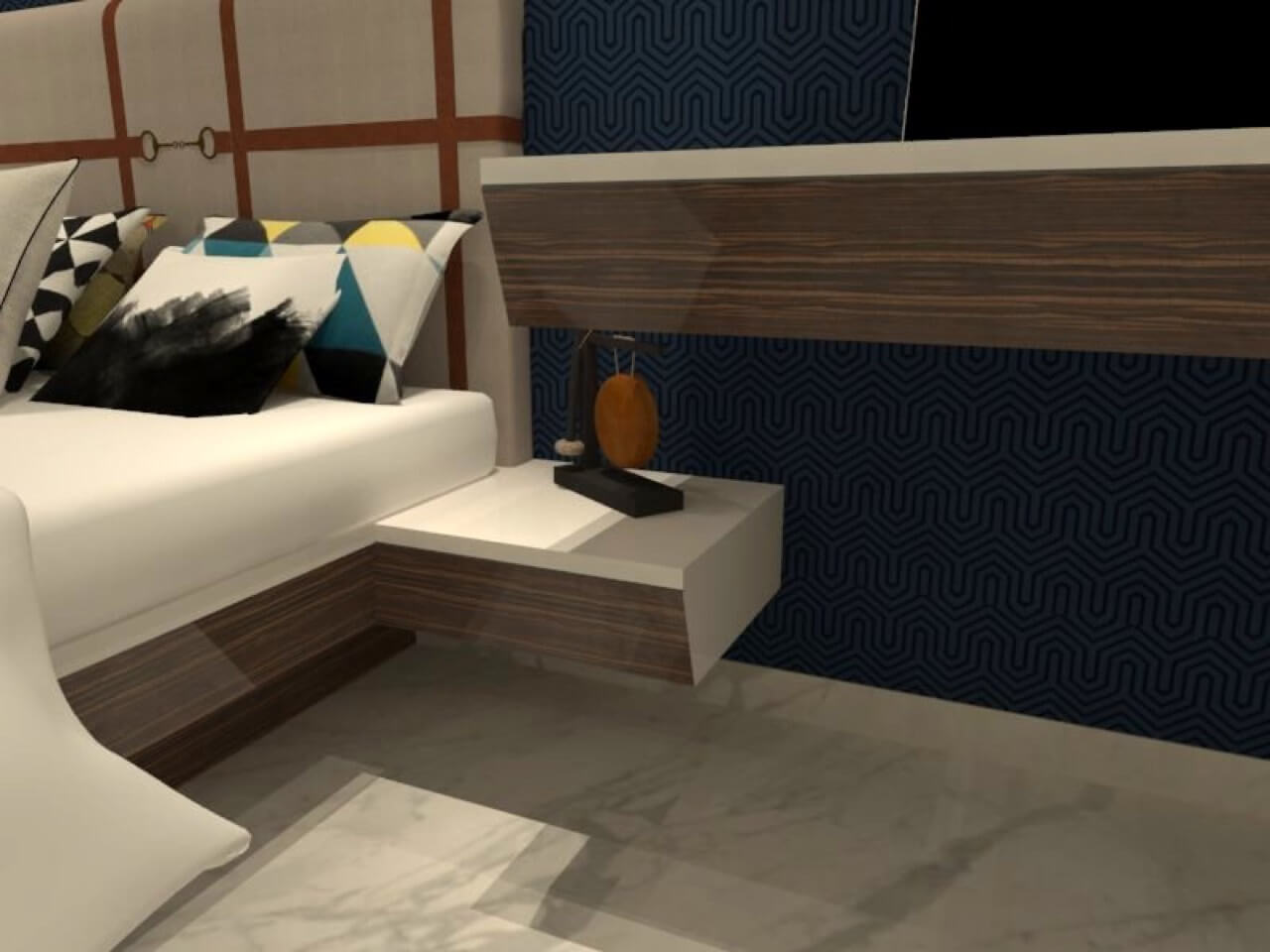
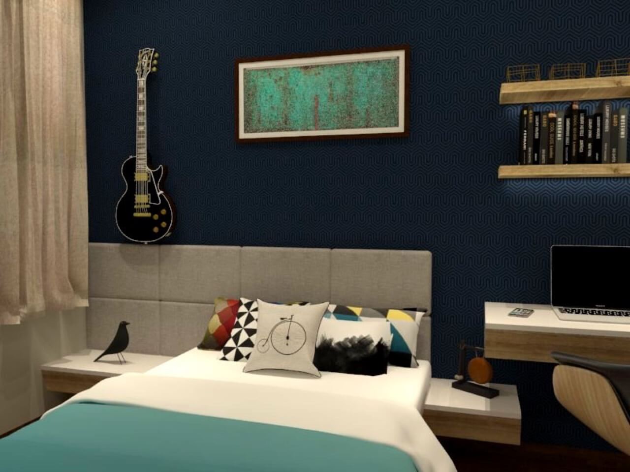
Division of wall colour horizontally into grey and white colour scheme became the main distinction point in the kid’s room. To add an attractive touch to the space, we decorated the area with some stickers on the wall like toy train. For aesthetic purpose, we have given hanging shelves and used veneer in wardrobe with PU shutters. As far as storage is concerned, PU was used in different colours apart from normal LED lights.
Did budget pose a challenge in this project?
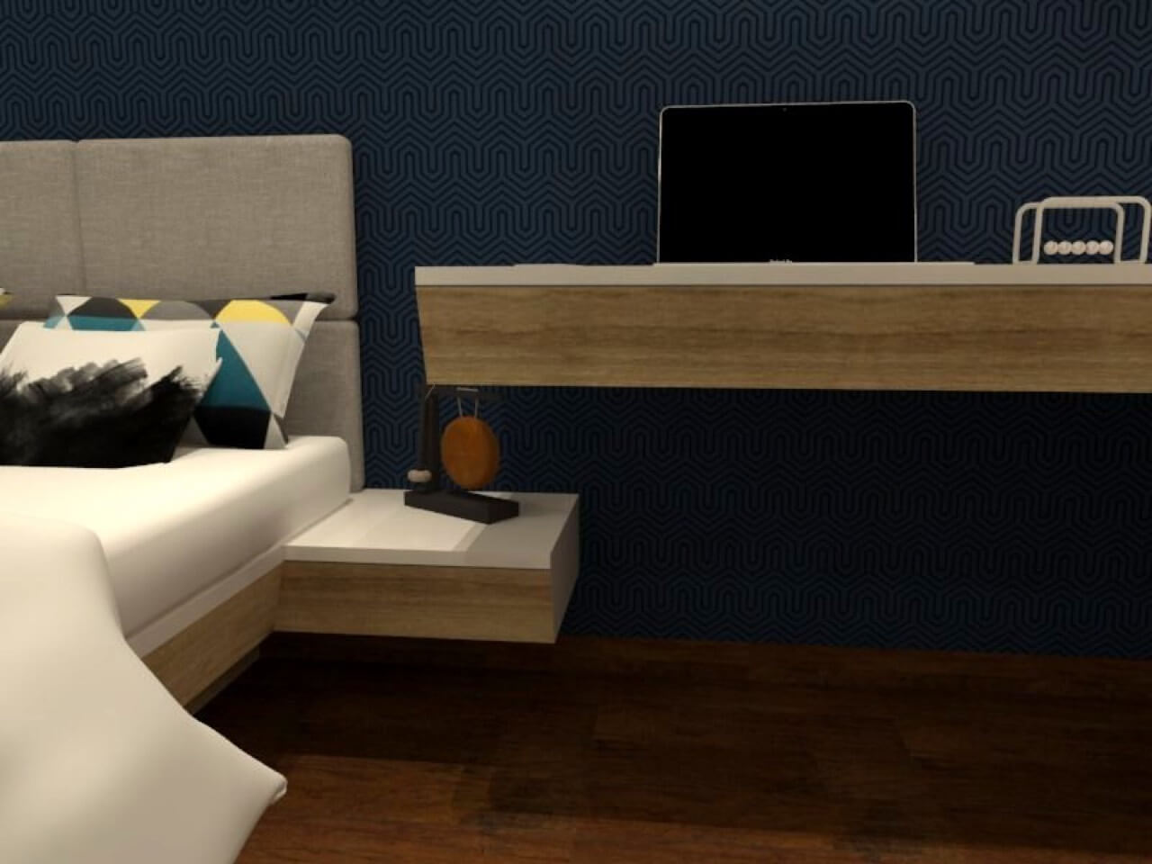
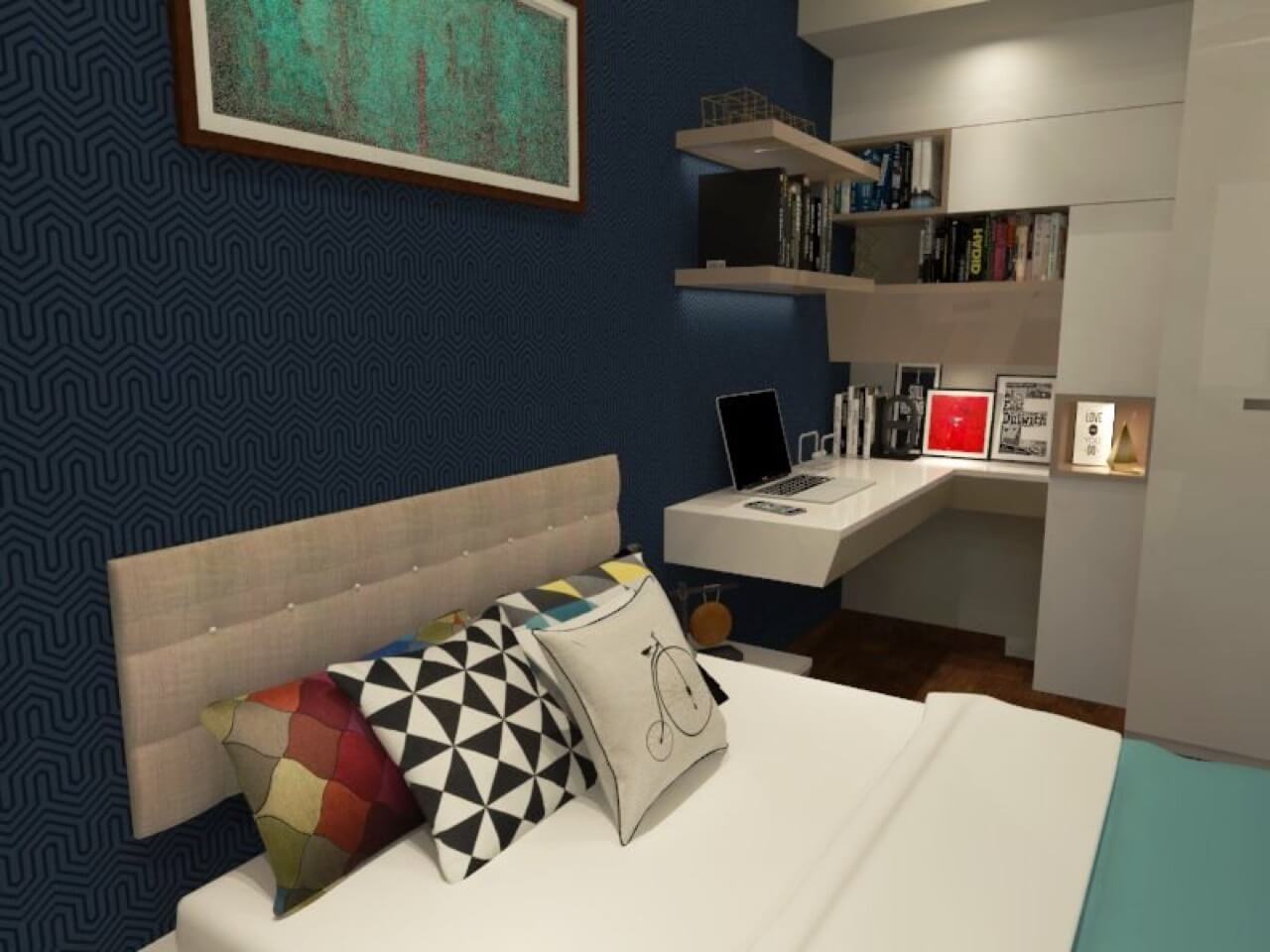
For the 3 BHK house comprising of 1300 sq. ft (110 sq. ft of kid’s space), the client had a very limited budget and convincing them to use PU in the room and colours as displayed in the 3D illustration was a major challenge. Finally it was decided to not paint the walls and the client settled for wardrobe and storage area in different colours.

