Kitchen décor with minimalistic theme and adequate storage depict a unique value. Arrivae discusses the thought process taken into consideration while using this theme in the kitchen supported with expert inputs.
Client Expectation: Desired a kitchen with minimalistic theme.
Uniquely Yours Solution: Effectively utilized the kitchen space with unique colour scheme and minimalistic theme.
Designer Makrand Dalvi
How did you execute the minimalistic theme in the Bharti Rane project?
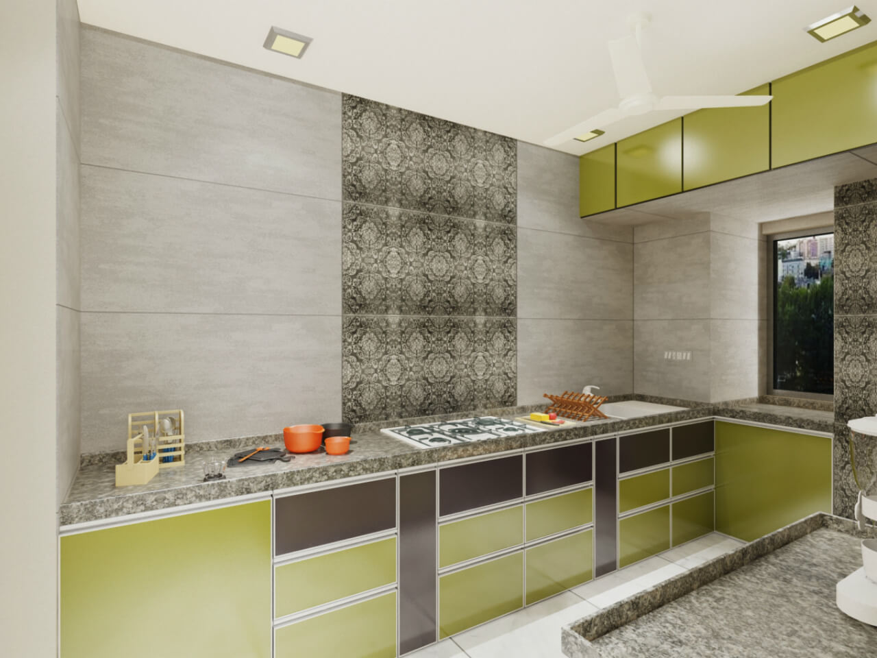
To adhere to the client’s interest of minimalist theme for the 2 BHK project, we ensured the kitchen space was utilized effectively as it was big in size. To begin with, we chose a unique colour scheme like olive green that depicts nature. On the whole, the kitchen has simple grey tiles. To break the monotony, you will find use of colour like olive green to complement the look and feel of the space. Before designing the kitchen, we showed the illustration to the client and she was convinced with the design sensibilities. The minimalistic theme is carried forward with simple plain lights and white ceiling. Floral tiles in front of the hob add a nice decorative touch to the kitchen.

Have you introduced any unique element to enhance the look and feel of the kitchen?
To give a smooth finish, we have used simple matte grey finish tiles in the kitchen. We have made an exception in this kitchen with 4/2 grey tiles, which are hardly used nowadays. This feature adds a unique touch to the kitchen. Since the client wanted a simple look and feel, we stayed away from using any jazzy tiles.

What kind of storage have you given to utilize the space effectively?
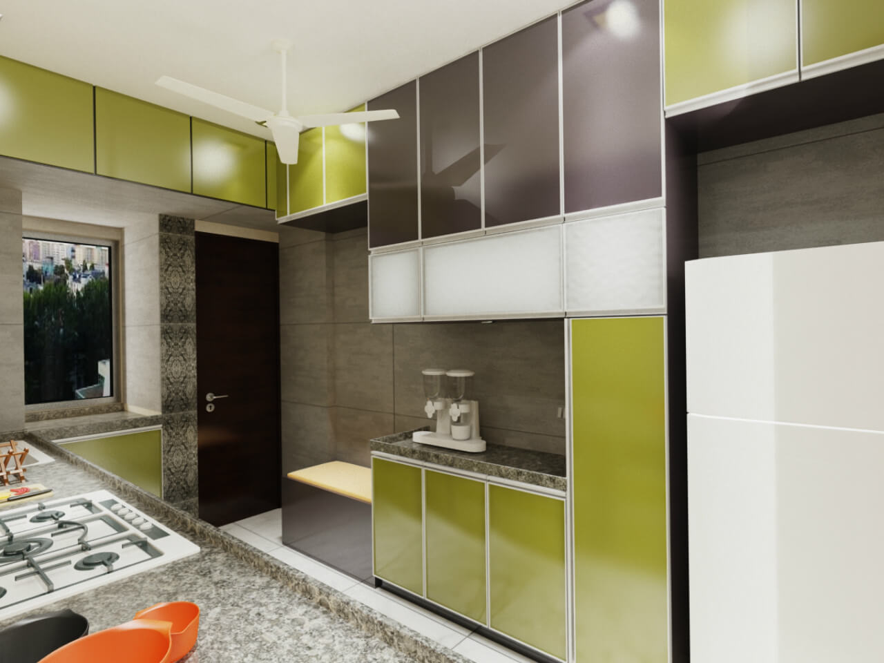
Firstly, we segregated the preparation and cooking area in the kitchen to give it a clutter free appearance. Adding appropriate storage without giving it a bulky feel was another step we kept in mind for this project. As a result, you will find the space behind the service counter used appropriately to keep the refrigerator. Similarly, to ensure minimum or no wastage of space, we have given loft and shutters on the top as well.
On the right-hand side of the kitchen, there was a window. Since we found that this window did not serve any purpose, we created an extra platform here and the remaining storage space was covered with shutters. The space above the loft is again covered with shutters. To enhance the space further, we didn’t provide any storage in front of the preparation counter and replaced it with back counter storage.
Was there any functional aspect taken care of in the kitchen?
As the client did not have too much expectation as far as the design of the kitchen was concerned, we ensured she had enough space to move around freely while performing her kitchen activities. Separate area for hob and preparation reiterate this and the safety aspect here.
A small seating provision was made near the preparation counter. This enables the family member to have a morning brunch before rushing to work. It could also facilitate the user to take a break or rest after her cooking activities. A simple trolley to accommodate all the kitchen essentials below the preparation counter is aptly located as it provides easy access to the inhabitant to perform her kitchen activities effectively.
Did the client have any specific theme in mind?
Initially the client desired a blue and white colour scheme for the kitchen. However we convinced them that a natural feel would be apt for the kitchen. We suggested an olive green and brown colour scheme for the same which was taken forward. The platform has black grey matte finish with stone texture and the middle portion has high back painted glass.
The client was very happy with the outcome and appreciated the texture given for tiles and concept used for the shutters. Similarly, the comfort factor was taken care of with appropriate placement of trolley and kitchen essentials that emphasizes on the ease of use factor to ensure everything was within the reach of the user.

