Optimum utilization and functional elements define contemporary interiors. Arrivae gets in touch with expert to explore the characteristics of this theme that gives it a different perspective.
Client Expectation: Mr. P Rakesh desired a modern cum contemporary theme for the interiors of their 3 BHK home comprising of one daughter’s bedroom, master bedroom and living.
Uniquely Yours Solution: Provided appropriate storage and enhanced the 3 BHK home with unique décor elements.
Designer Suryakant Jadhav
How was your relationship with the client?
We knew the client since 2004 and shared positive vibes. Since we share the 3D visualization of the design in advance, the client gets an idea on what to expect and is aware of the design perspective, which leads to less hassles later on.
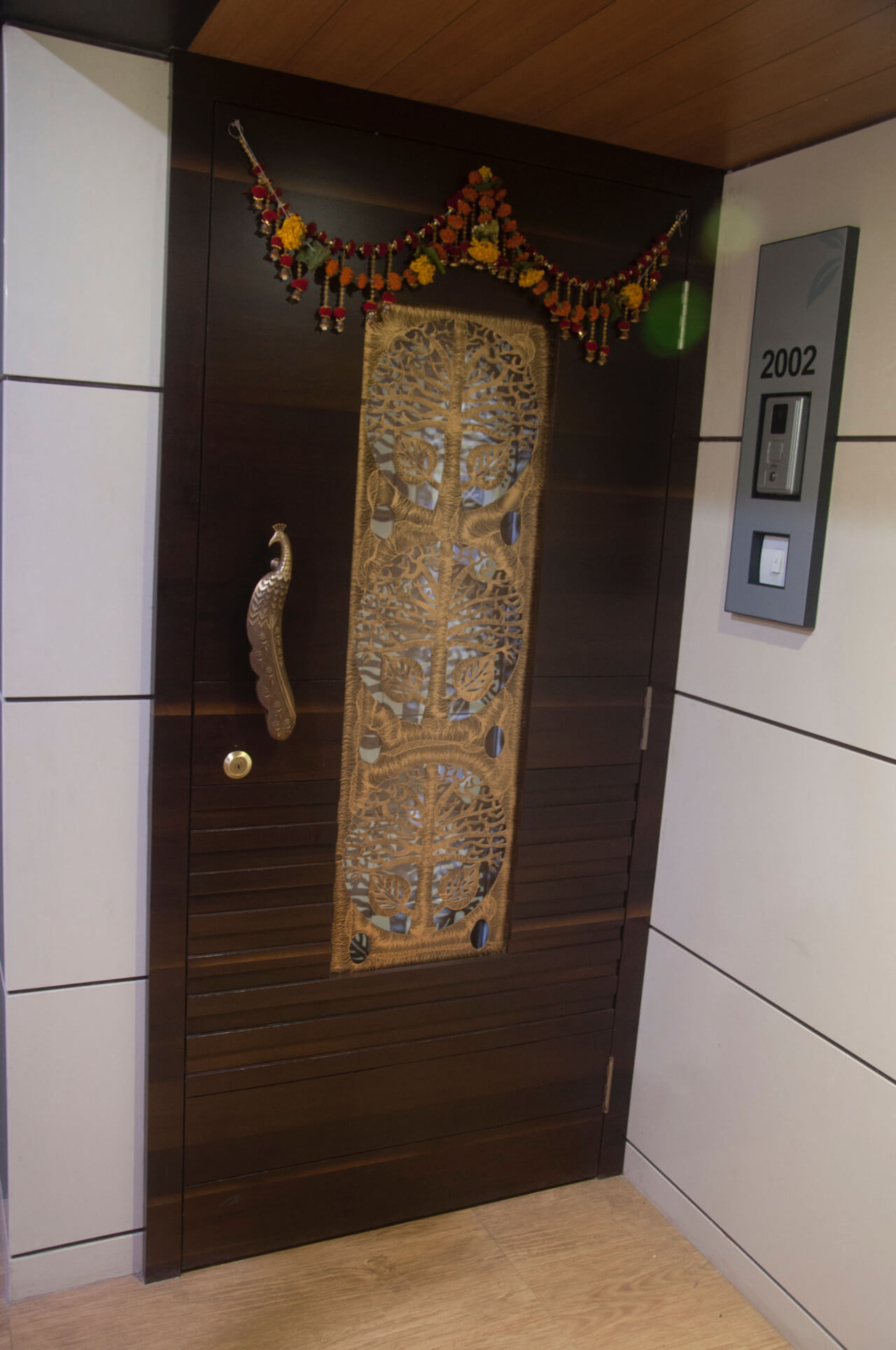
What steps did you take to achieve the modern cum contemporary theme for Mr. P Rakesh?
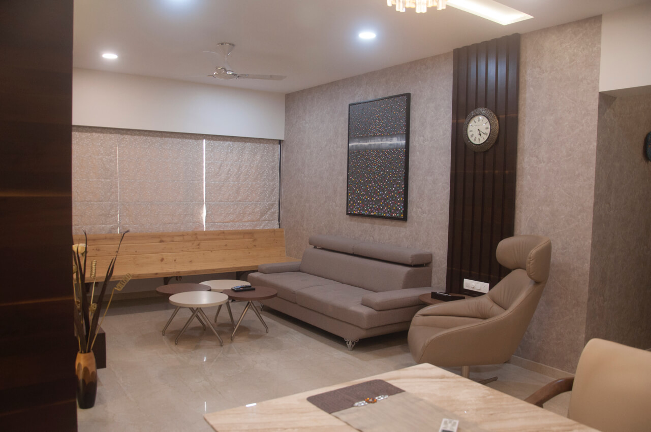
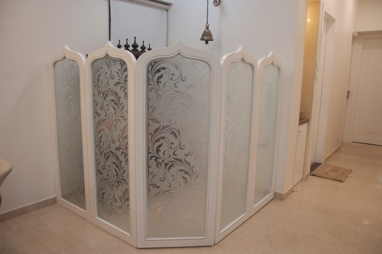
Firstly we opted for a neutral colour scheme like veneer, beige and shades of brown. This gave a sober touch and airy feel to the space. Another important aspect of this project is effective utilization of space. To give a transitional impact here, one of the corners of the living area was converted into an enclosed pooja room. Maintaining the sanctity of the temple is the sober colour scheme and minimalistic décor.
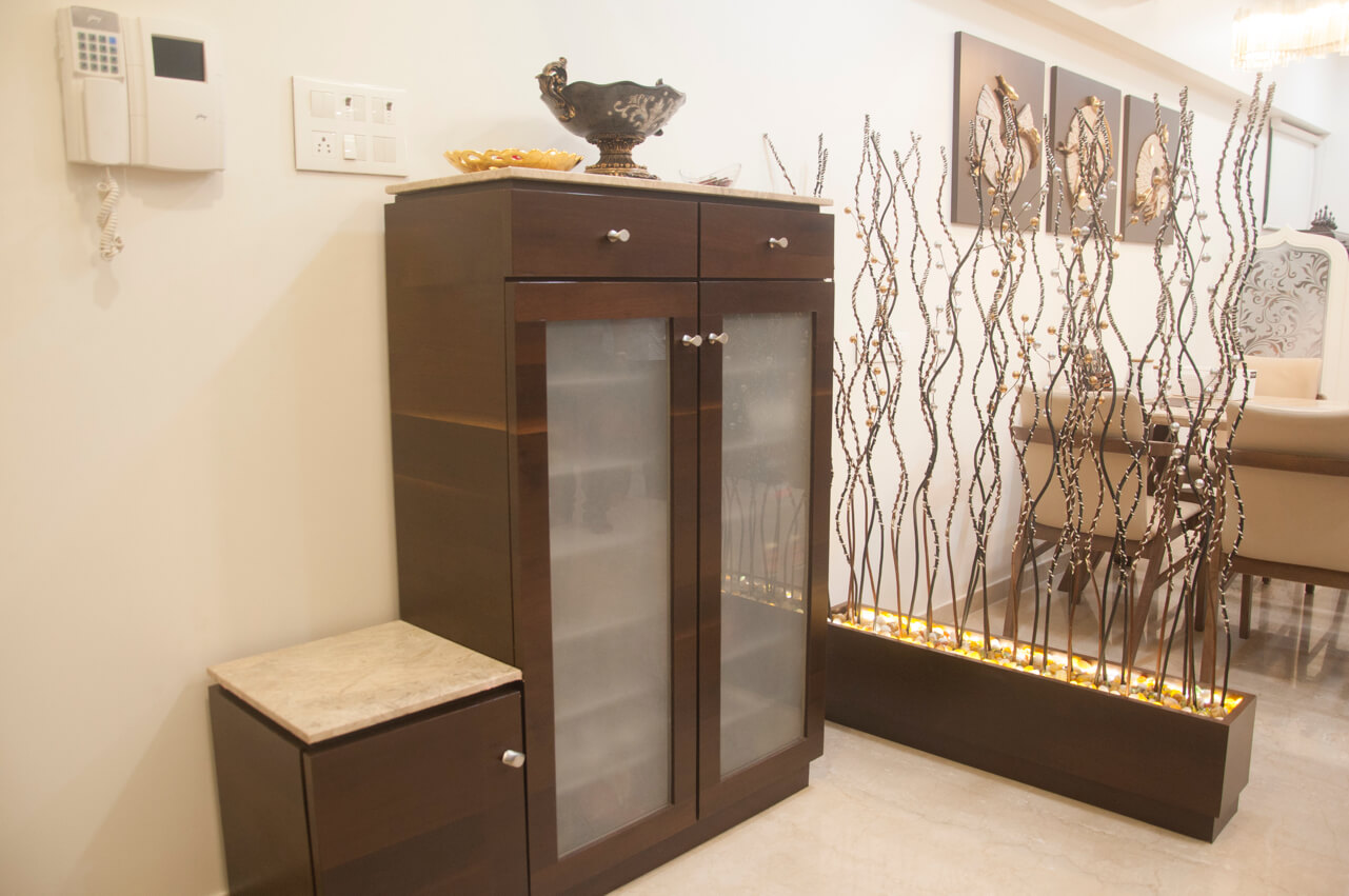
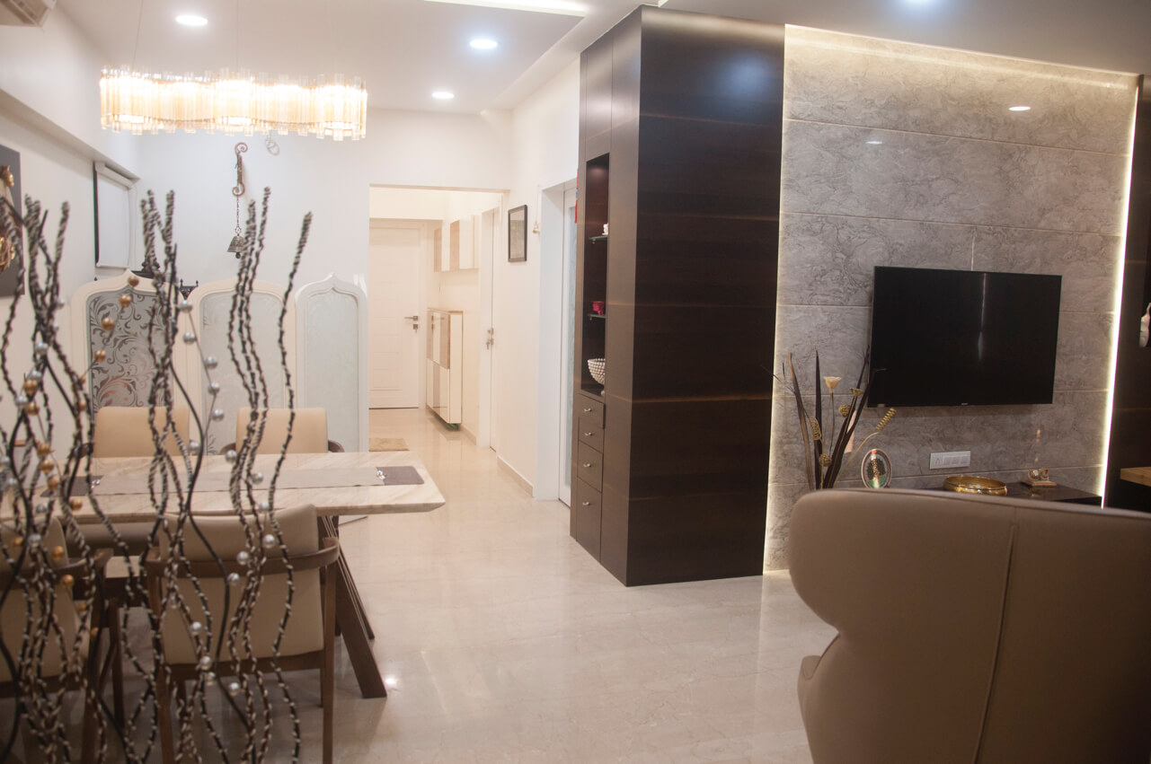
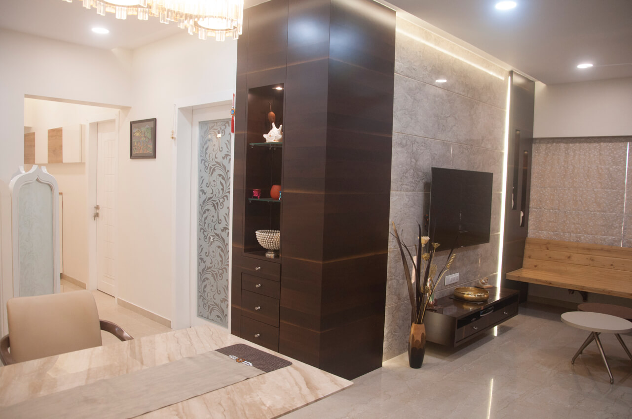
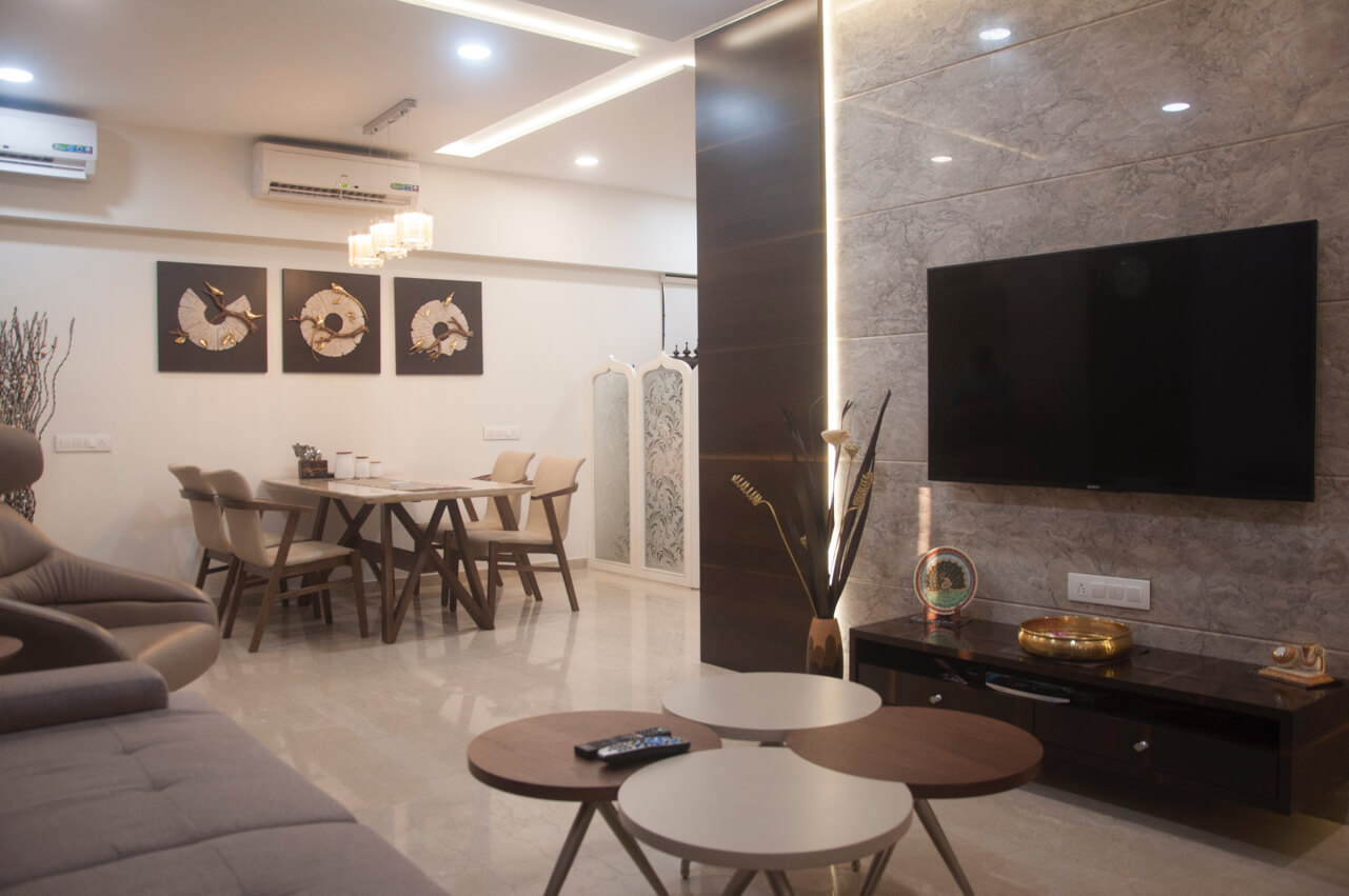
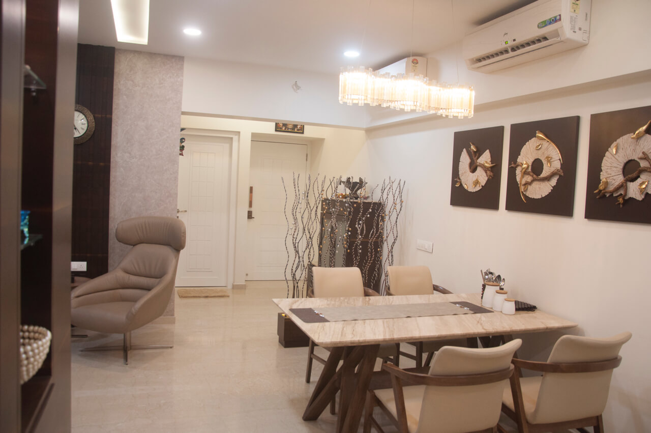
The subtle colour scheme was continued in the living area as it is decked up in cream accent throughout. Use of Italian marble on the television wall cladding adds a positive vibe to the living. We used decorative dry stick to seamlessly segregate the entrance from the living area, adding an attractive touch to the space. To pump up the glamour quotient a notch higher, designer wallpaper and a painting inspired by the mob design adorns the wall. The window with pine setting blends well with the overall look and feel of the living.
Tell us about the functional aspect of the project?
The client had a dry balcony where all the AC outlets were kept. The builder had given provision for washing machine in this balcony. To maximize this space to its optimum level and make it functional, we provided an additional storage above the balcony door and covered the pipes provided by the builder with aluminium composite sheet (ACP) to give it a clutter free appearance.


How did you add a designer touch to the master bedroom?
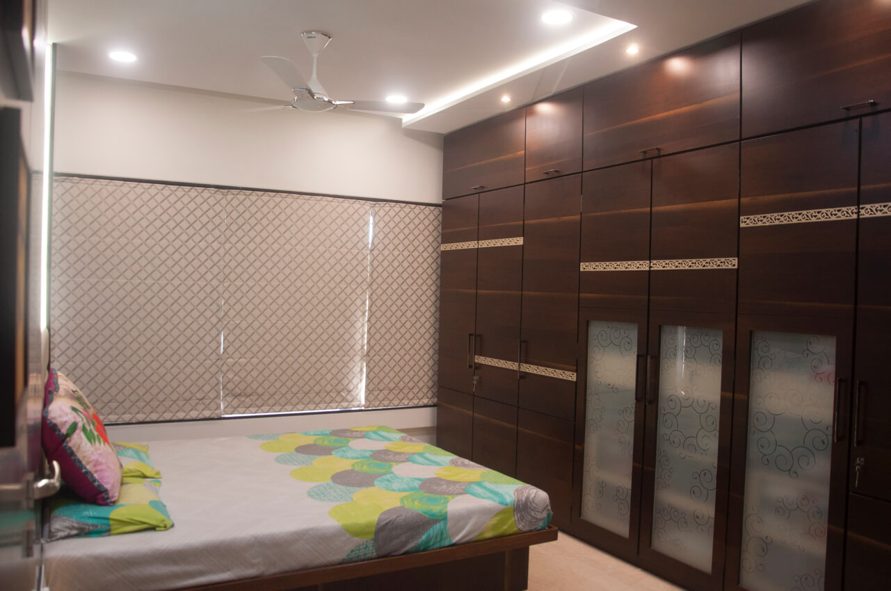
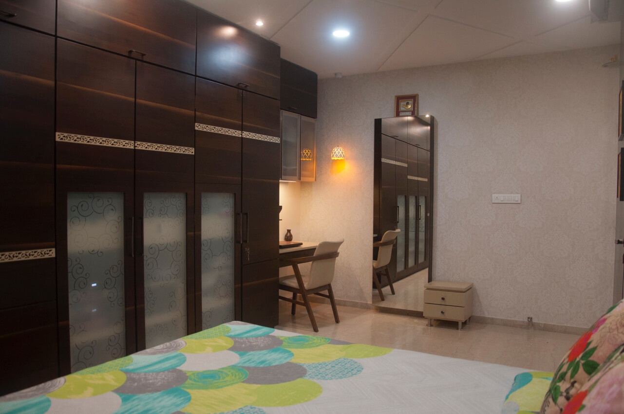
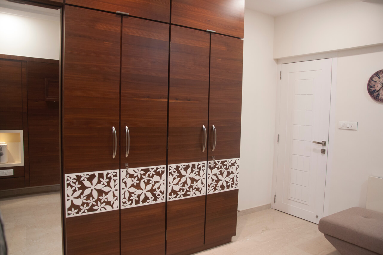
P Rakesh wanted a cosy look and feel for the master bedroom. To achieve the desired look, we used veneer paneling behind the bed. Another highlight of the master bedroom is the back-painted glass with curvature design above the bed. The family comprising of three members had a big wardrobe for ample storage. To break the monotony of wooden accent that adorned the wardrobe, all the shutters of the wardrobe are decorated with CNC Corian material and opaque glass. Lighter shade wallpaper that resembled white and beige hue gives a designer touch to the bedroom. The master bedroom also makes way for a dressing unit with pouffe apart from the working table that was decked up with Corian again.
How did you ensure the parents’ bedroom had the right functional elements?
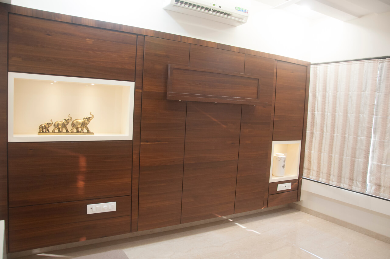
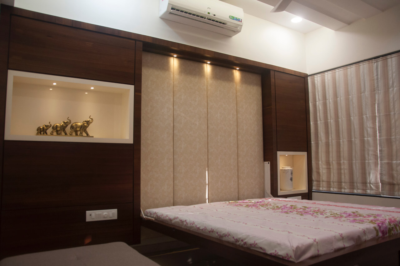
Multipurpose use is the basis of the parent’s bedroom. All the functional aspects have been taken care of considering the inhabitant’s taste and interest with an intention to use it as parents cum guest bedroom. The space has been given a simple and sober touch. To add a touch of elegance here, we have given appropriate furniture like foldable bed. This bed can be converted to a table to accommodate the guest luggage and when not in use it could be attached to the wall so that it can be used as a bed. Taking the decorative element a step ahead is the four shutter wardrobe that has been decked up with CNC in white colour. On the left hand side there is a dressing with full shutter. Enough storage with decorative niche has been provided to accommodate the parent’s requirements and necessities.

