Interiors can be decorated and given a green touch using the modern theme. Arrivae interacts with expert to understand the style that can be worked out to incorporate the green element.
Client Expectation: Mr. Vikram (Surat) was doing up his interiors for the very first time and desired a combination of modern cum minimalistic theme used for the project.
Uniquely Yours Solution: Executed the 4BHK project with features incorporating modern and contemporary elements with open garden.
Hardik Gohel
What was the design concept used for the project?
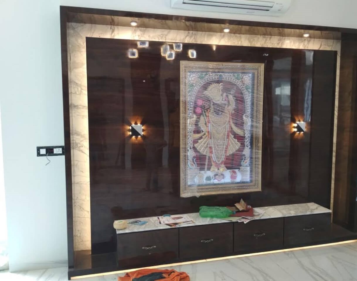
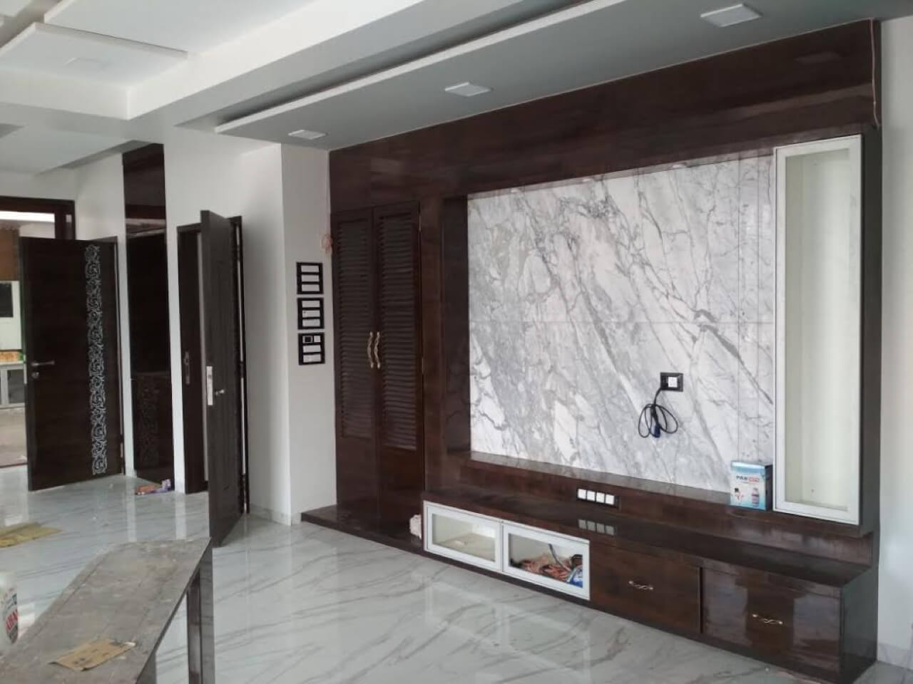
We used the modern theme for this project adhering to the requirements of the client. The entrance of the living area was highlighted with Shreenathji’s work frame. For this, we designed the wall to fit the frame as the frame was already available with us. The electric unit was given besides the television unit with wooden and veneer louvre shutters to take care of the ventilation aspect.
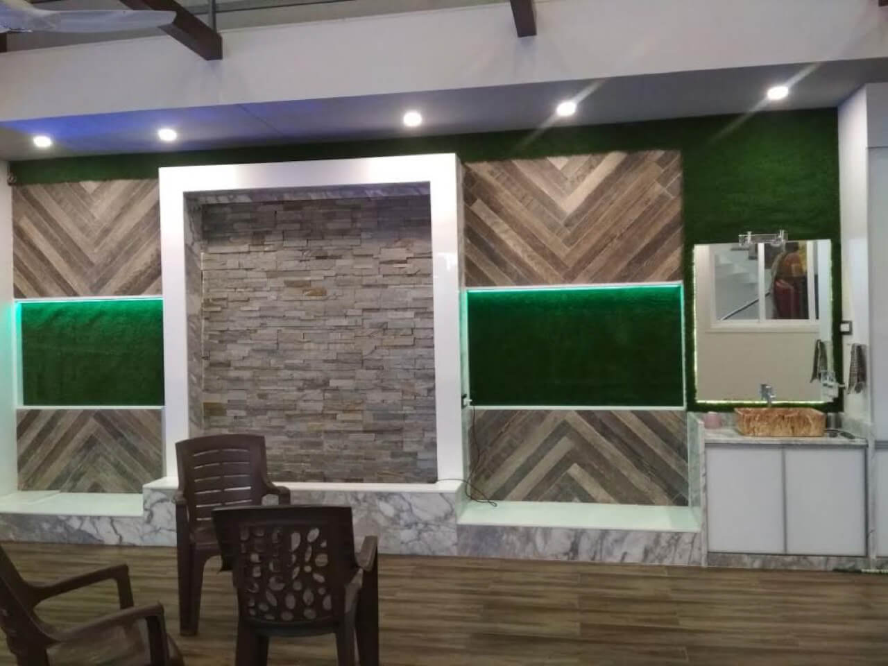
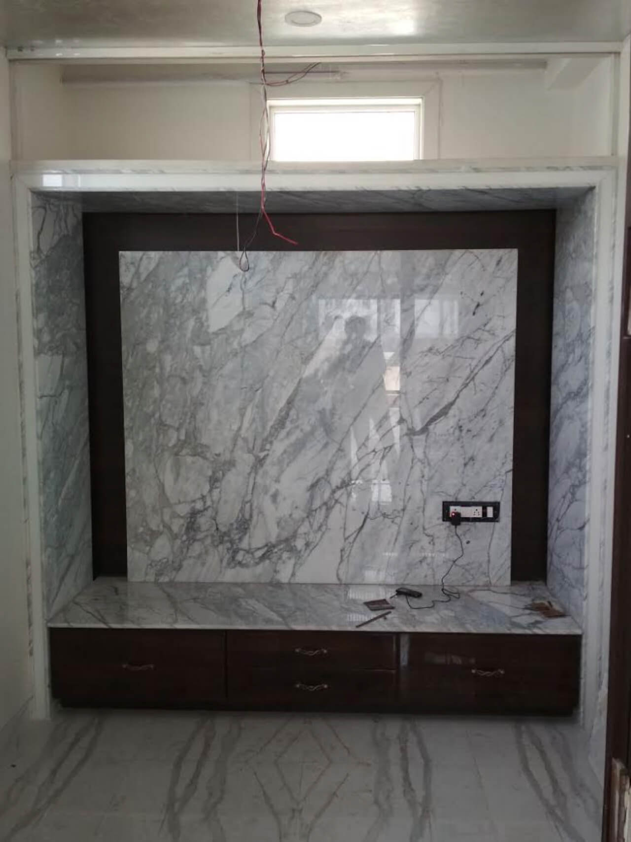
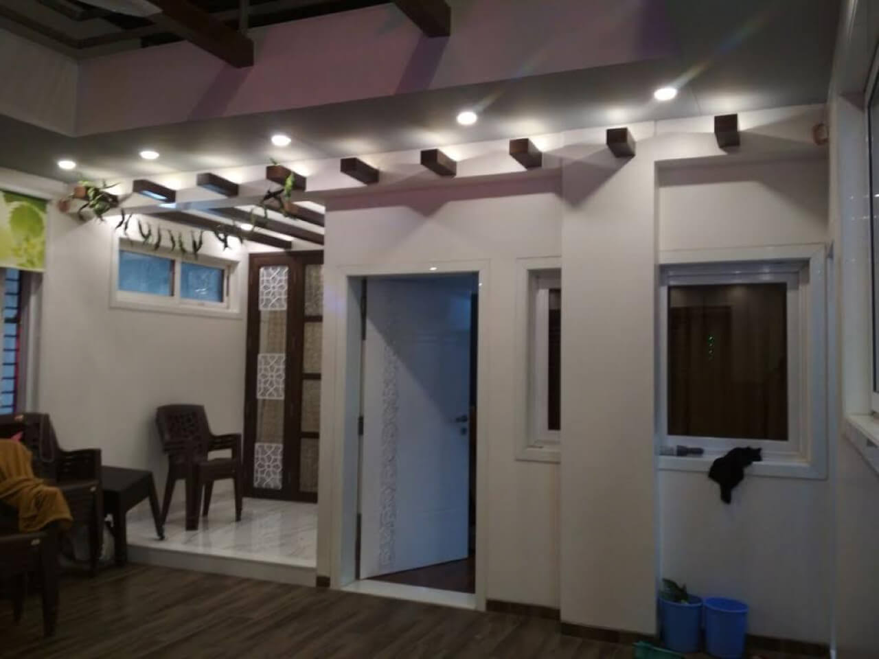
As far as furniture was concerned, we finalized the design of the grey sofa from the catalogue book. Slim unit for the television with full wall cladding in Italian marble with groove adheres to the modern concept desired by the client. To add a decorative touch to the living, we gave one small unit with profile shutter apart from full height window. There is a waterfall given at the entrance of the bungalow as well. On the left and right side of the entrance, we have given greenery on the wall and embellished it with lights on all the four sides.
Doors have been done in MOP leather cutting. The entrance gate is enhanced with remote operation and sensor. On the second floor, vacant space was left on the top so that it could be utilized for parties and functions. The terrace also has a half open and half closed look and feel.
Tell us about the highlight of the project.
Mr. Vikram desired a garden in the hall area. For this, we gave sliding folding aluminium shutter for one part of the garden. The reason for doing this was to make this area look more spacious on entering the garden. To highlight this area, we used features like waterfall and open roof facing the sky. The garden area is enhanced further with open shower to help the client’s family enjoy a rain like effect for leisure purpose. Seating arrangement and a swing was also suggested but the client refused as his kid’s were naughty and wanted the garden area left open to help the children enjoy uninterrupted playtime. Washbasin and storage area was also provided in the garden. For connection and protection of water, the motor for the shower was arranged inside the storage. Another roof on the terrace above the garden area was decorated with MS frame.
Did you face any challenges while executing the project?
The client had approved the 3D design of the project. However, they would suggest changes every now and then. Executing the changes instantly was one of the challenges we faced but this was executed promptly. We had given lot of greenery in the garden. However Mr. Vikram didn’t want too much greenery in the garden as it would lead to maintenance hassle. To take care of this aspect, we used less natural greenery and more of artificial turf.
How did you execute the design in the master bedroom?
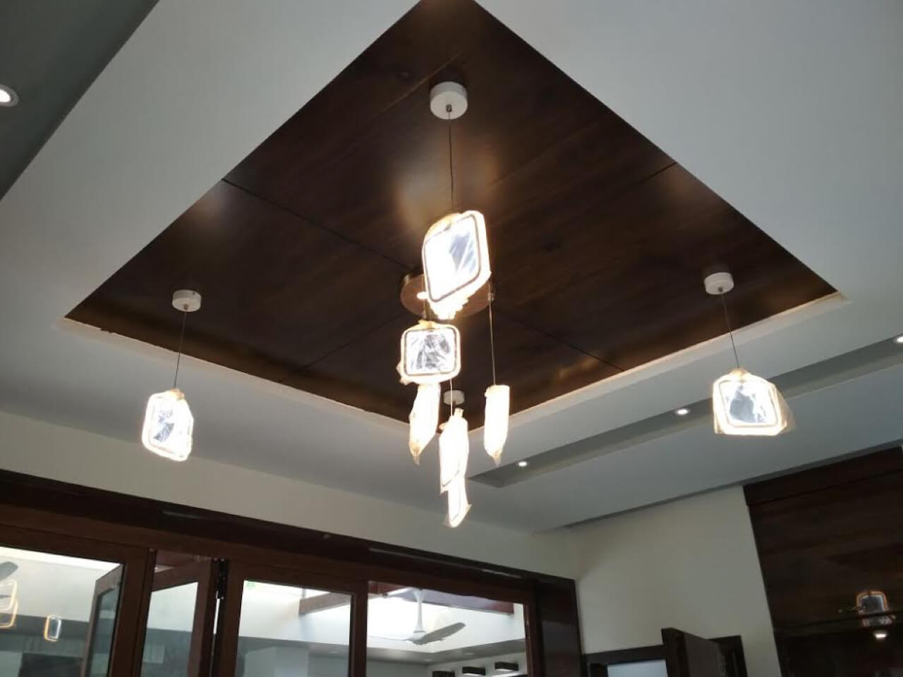
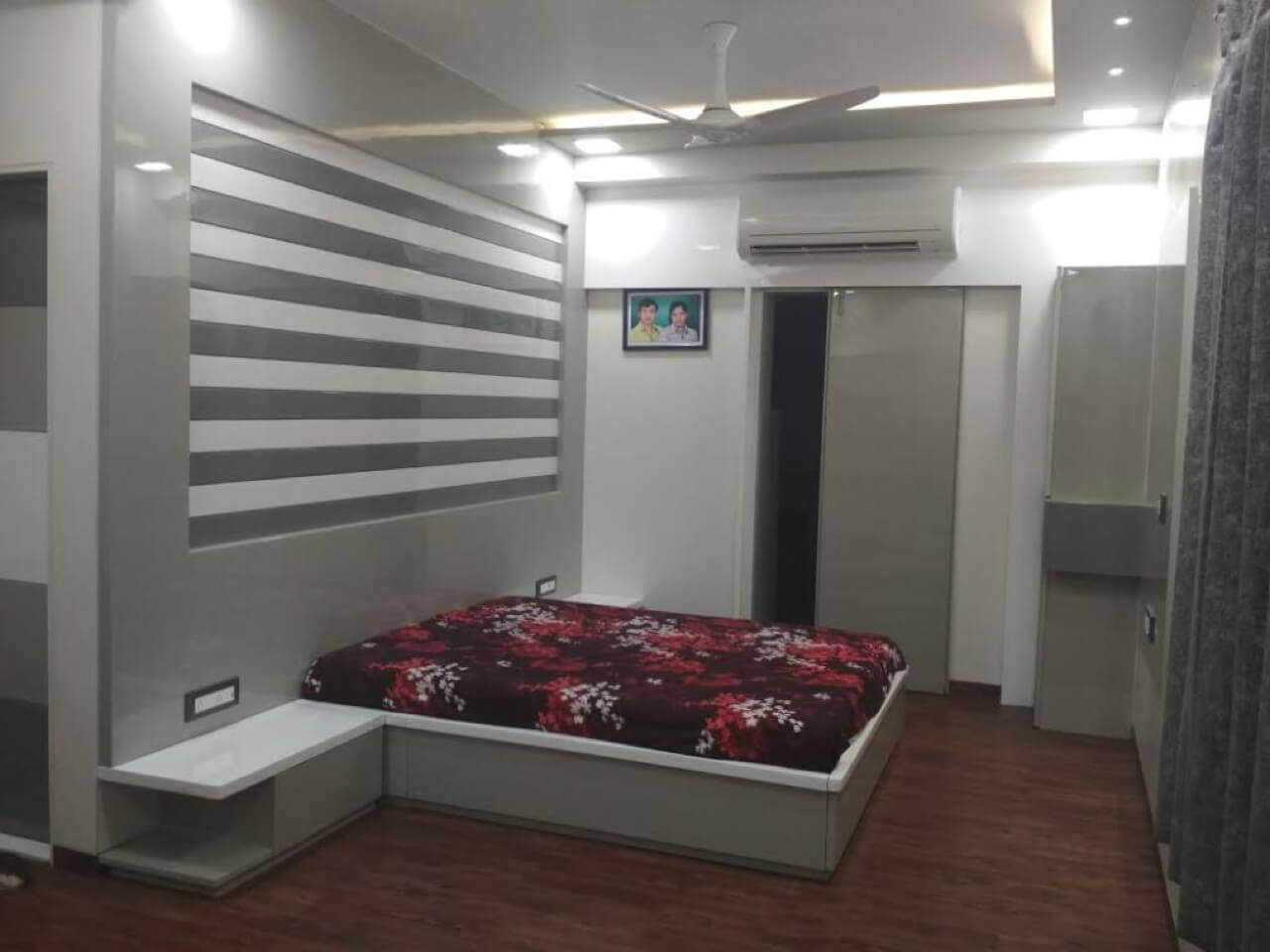
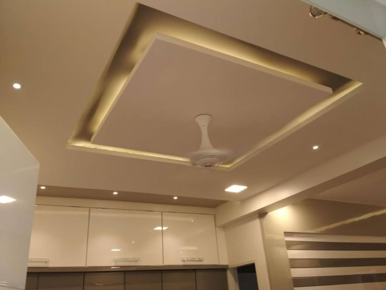
We used brown and veneer colour scheme for the master bedroom. There is study, television and dressing unit given. Additionally, we have given a walk-in wardrobe for the client. There were three windows in this area and one of the windows behind the bed was decked up with solid shutter so that the second window could be closed for maintenance purpose. Profile shutters for study unit and open shelves have been given for books. For aesthetic reasons, indirect and direct lights apart from wooden texture paint have been used on the ceiling and Statuario tiles have been used for the flooring.
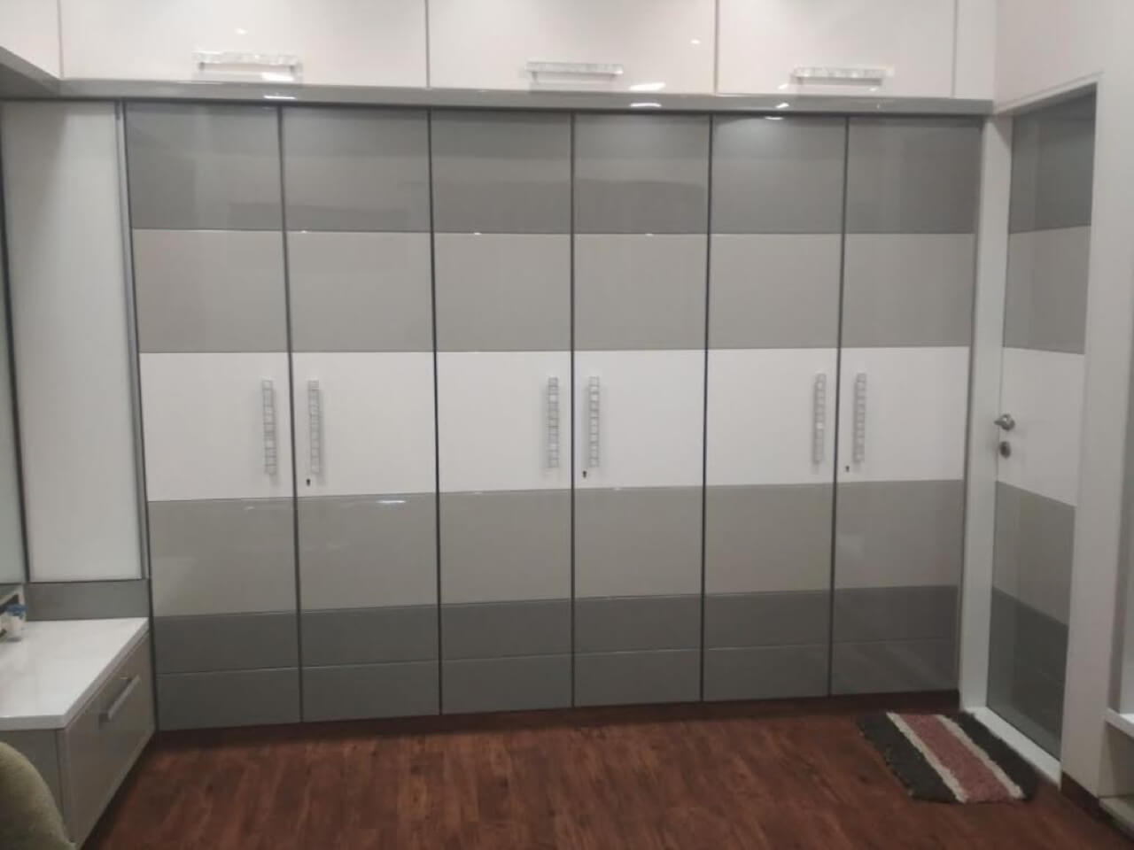
There are grooves given in the bed to cater to the requirements of the client as they wanted a plain design with grooves and PU coating in white. We took care of important elements like safe, two drawers, shelves and hanging space apart from drawers given below the wardrobe.
How did you give a unique touch to the temple area?
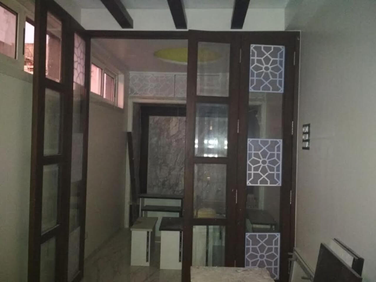
There is a temple area created besides the parent’s room. Wall has been decked up with Italian marble and frame with indirect lights. The top portion of the temple has laser cutting grill acrylic with backlit feature. Dome ceiling and silver leaf paint gives an aesthetic look and feel to the kitchen. For decorative reasons, the entrance of the temple has wooden shutter with glass. The ceiling also has wooden rafters and light is on the top side of the ceiling for decorative reasons.

