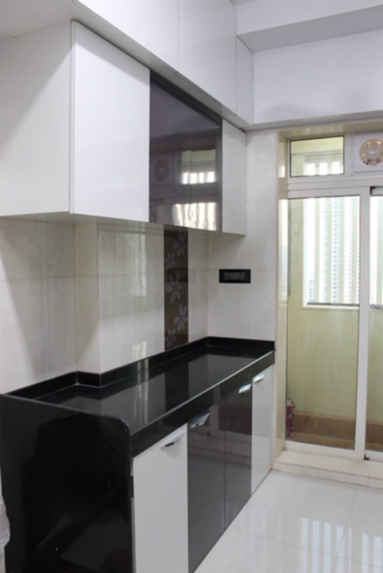
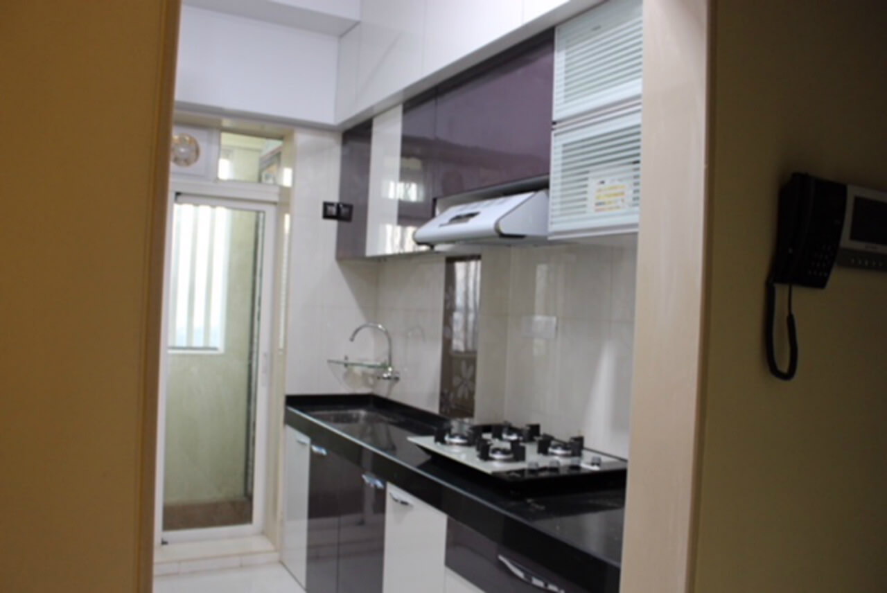
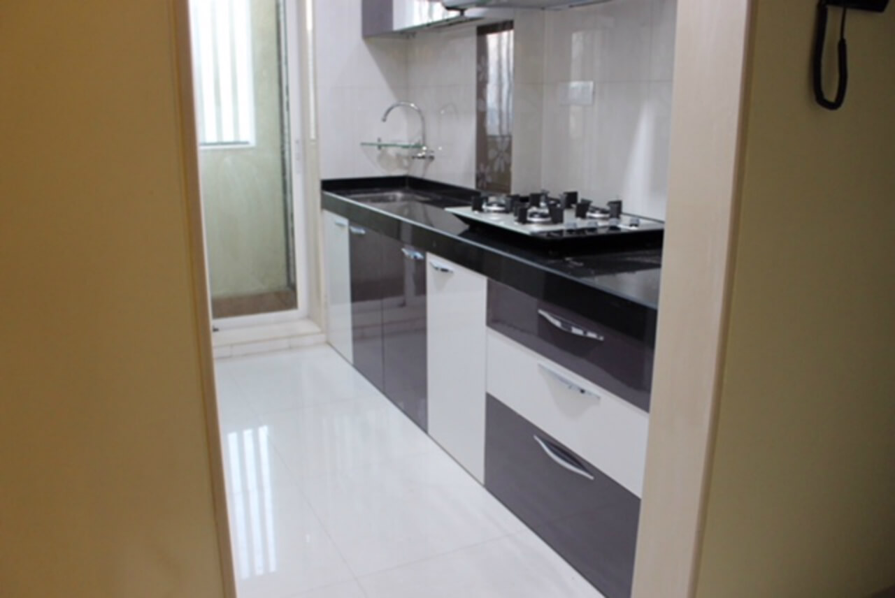
Kitchen space with a parallel design offers easy to access areas. Arrivae touches upon the convenience aspect of this design with significant inputs from the expert.
Client Expectation: Desired a unique colour scheme and shimmer design for the kitchen.
Uniquely Yours Solution: Provided parallel design and used laminate with sparkle design as a decorative element.
Designer Kalpana Shelke
How did you ensure that the small kitchen was utilized optimally?
For Chandrakant Waykar’s small kitchen comprising of approximately 100 sq. ft. area, we ensured to accommodate all the necessary storage like two overhead storage, one above the counter and another touching the ceiling. Since these storage touch the ceiling, it does not look like storage. We also gave an extra storage unit above the sink. This could be used to keep the washed plates and water would drain off directly into the sink. Aluminium profile shutters were also used in the kitchen.


What was the colour scheme used in the kitchen?
To cater to the client’s requirement, we chose wine and milky shade colour scheme for the parallel kitchen. The space was decked up mostly in white to give it a spacious look and feel. Splashes of wine complement the white colour seamlessly. To break the monotony of white that dominates the kitchen, there was a floral design given on one of the walls. Chandrakant Waykar was quite impressed with the final outcome. Light colour scheme like milky white combined with shade of wine does not make the space look bulky. To add a decorative touch to the kitchen, we have used laminate with sparkle design. This adheres to the requirement of the client.


Was there any safety aspect to be taken care of in the kitchen?
The edges have been secured with age bend patty. This ensures the user does not get hurt while performing kitchen activities.

