Office interiors can be given a unique touch with decorative features. Arrivae finds out the different ways these elements can be used to highlight office interiors.
Client Expectation: Mr. Neeraj Amar Chedda (Rajkot) wanted a separate seating area with designated spaces for car and seat cover display apart from cash counter.
Uniquely Yours Solution: Executed the project with unique design and display of company’s products.
Hardik Gohel
How did you give a unique touch to the office?
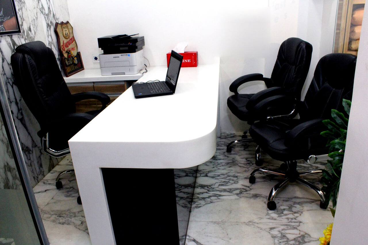
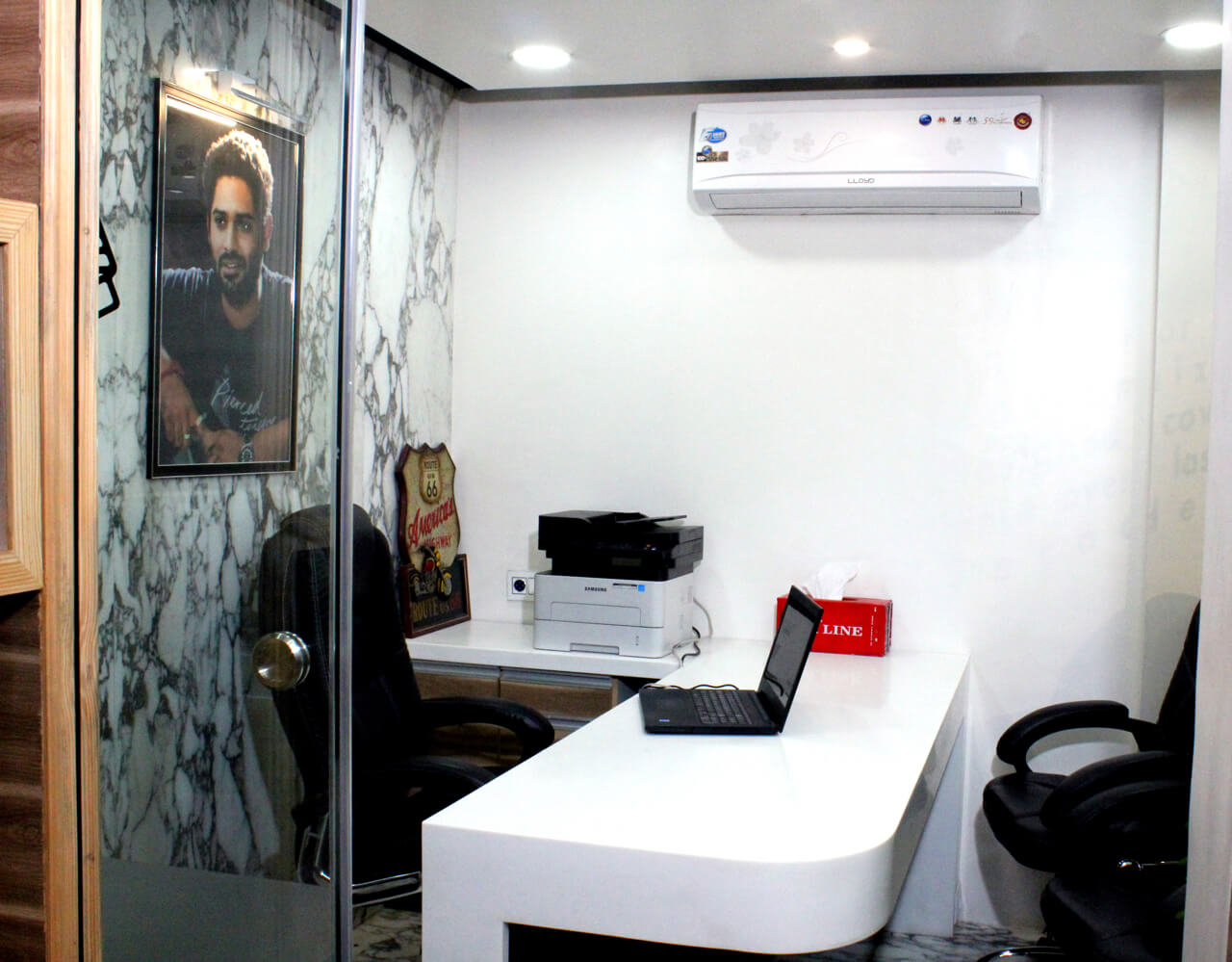
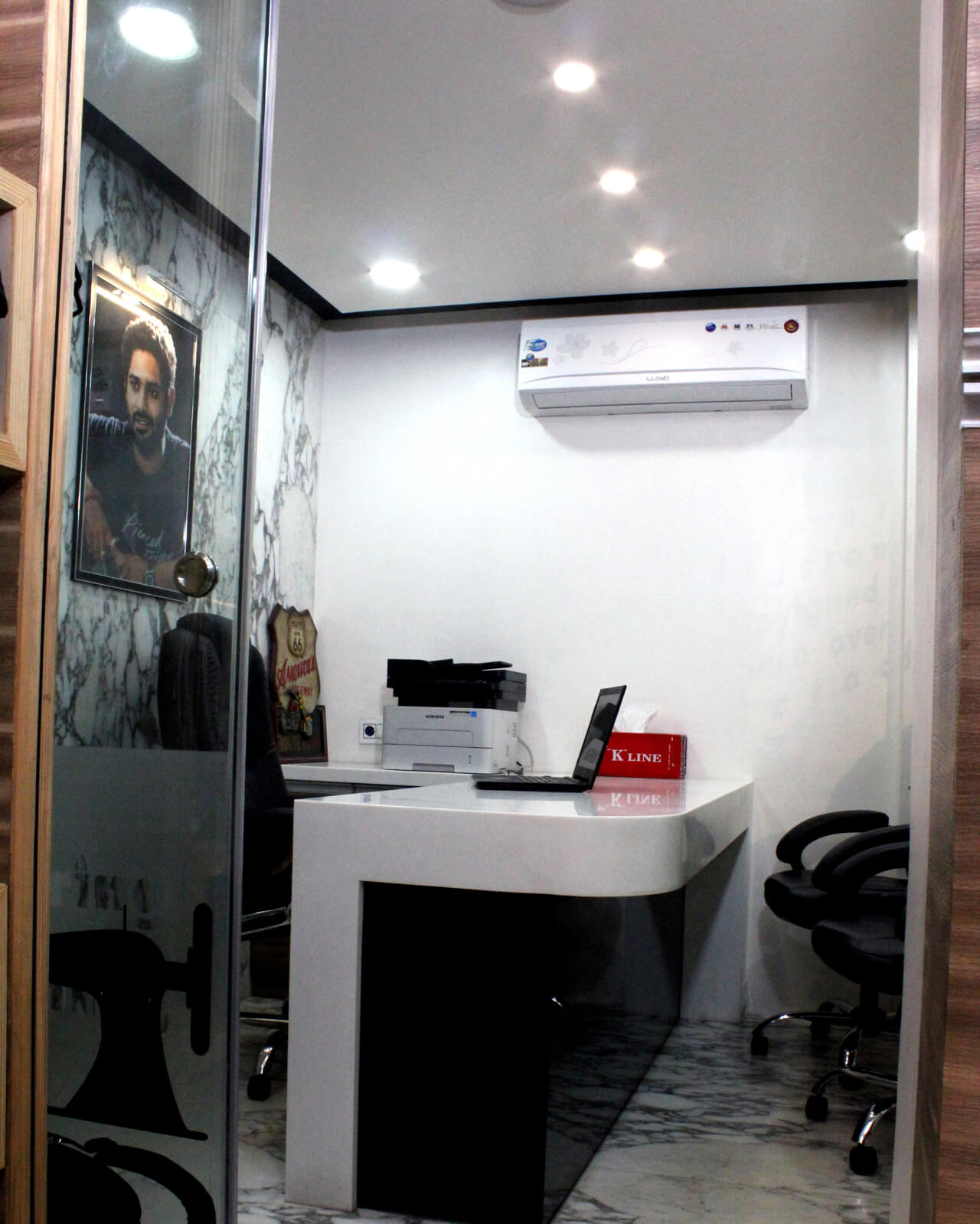
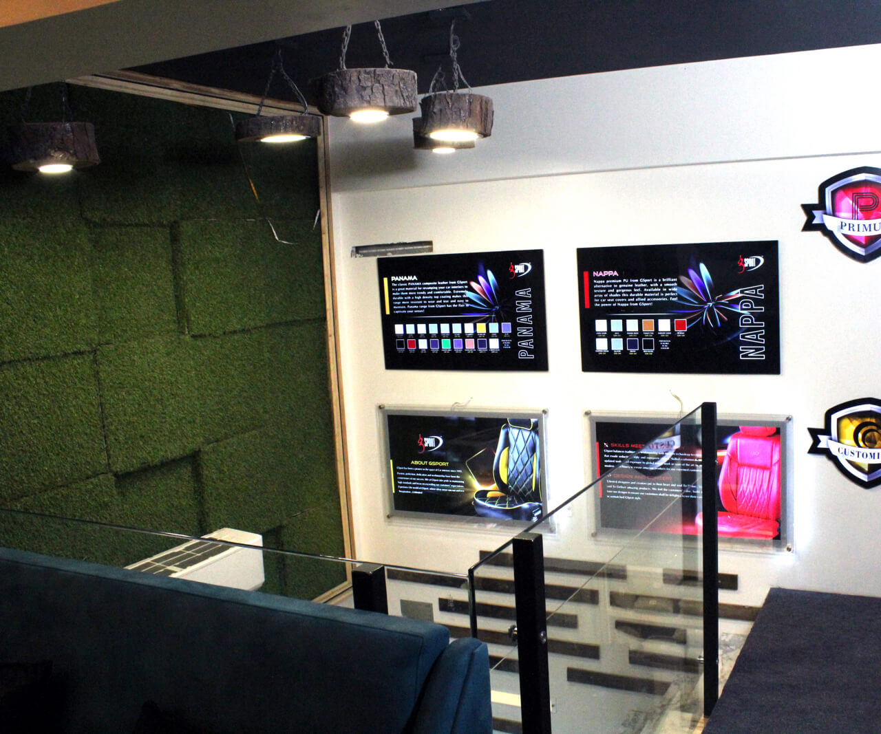
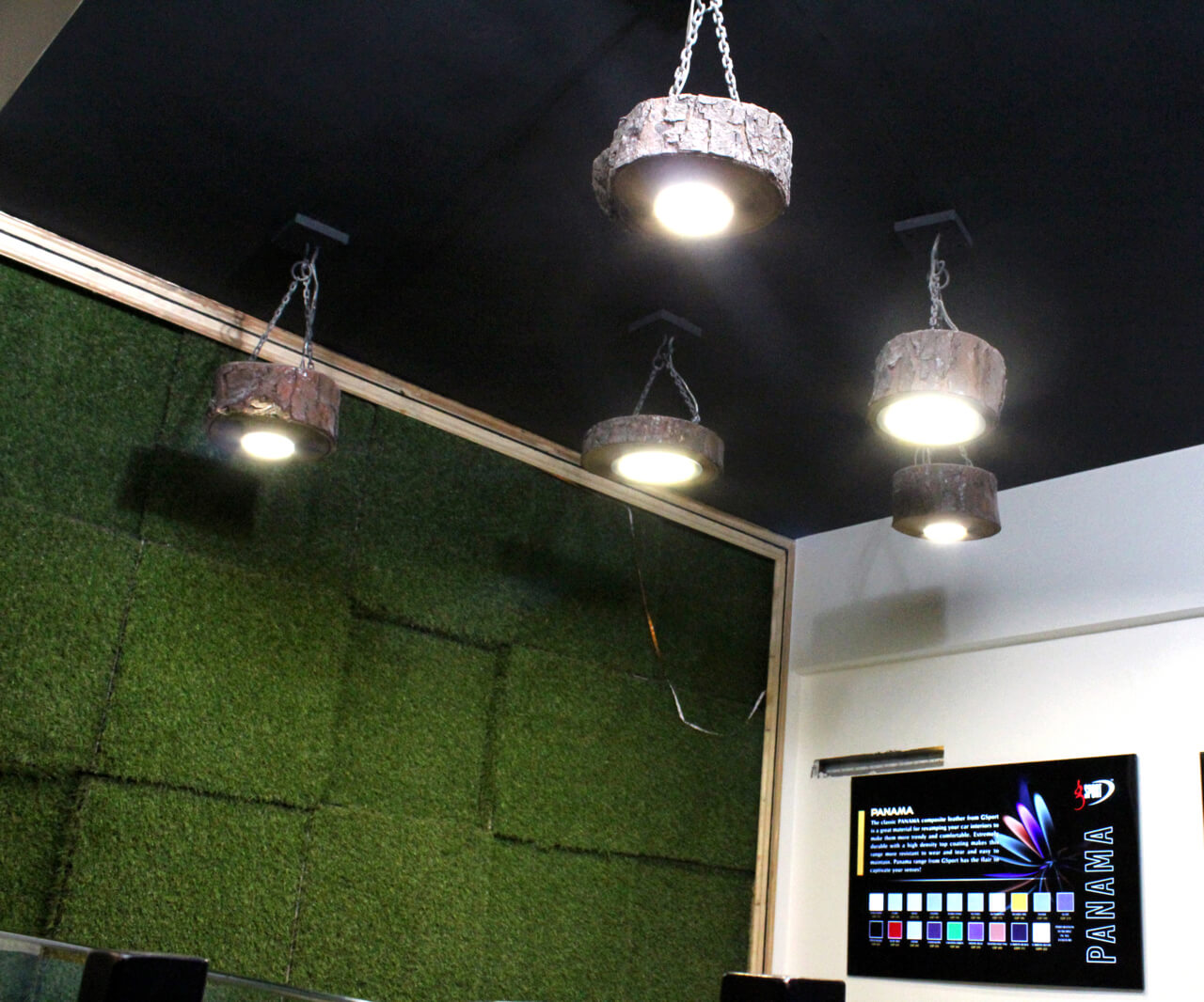
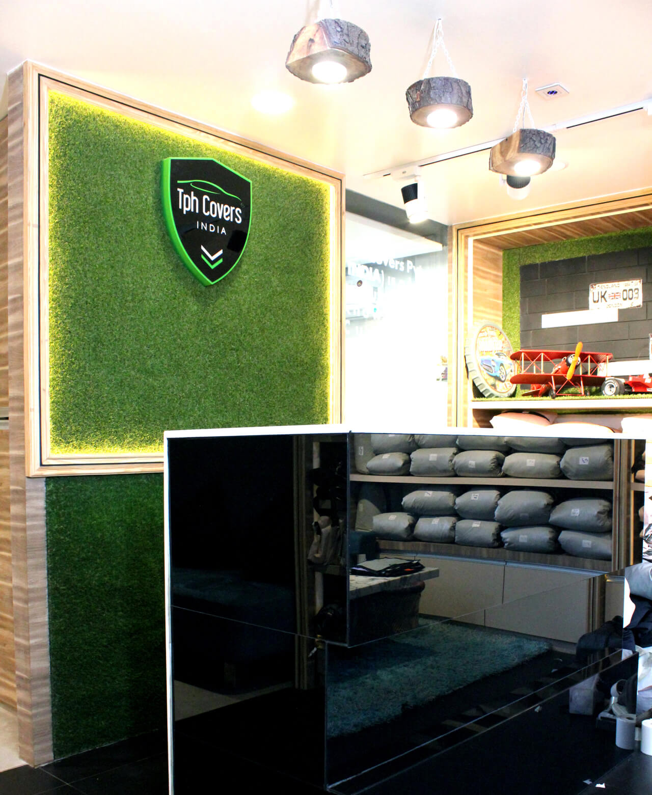
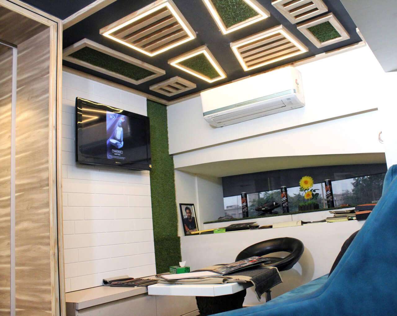
The office area was designed on the back side of the cash counter. The main distinguishing feature of the space is the use of the branch of the tree as light fixture on the ceiling above the cash counter. To highlight this unit, the wall unit was given a backlit feature. Hanging light with the tree branch theme has been added on the entrance ceiling apart from the top portion of the table.
Tell us about the design concept used?
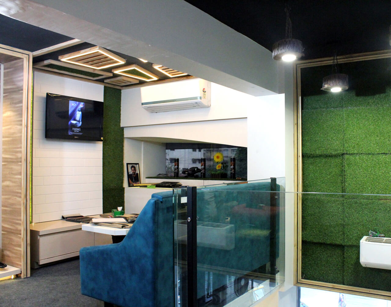
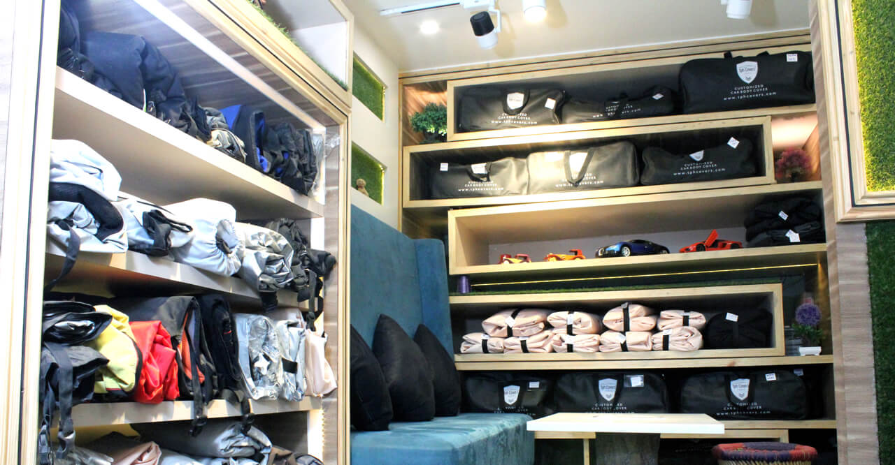
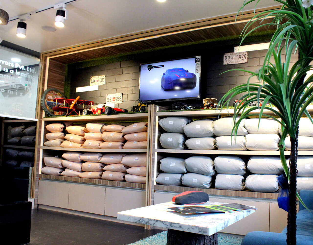
On the right hand side of the entrance, we have given a unit with a designer touch and low height storage for car covers. This unit also has a television that displays the presentation of different car covers available with the company.
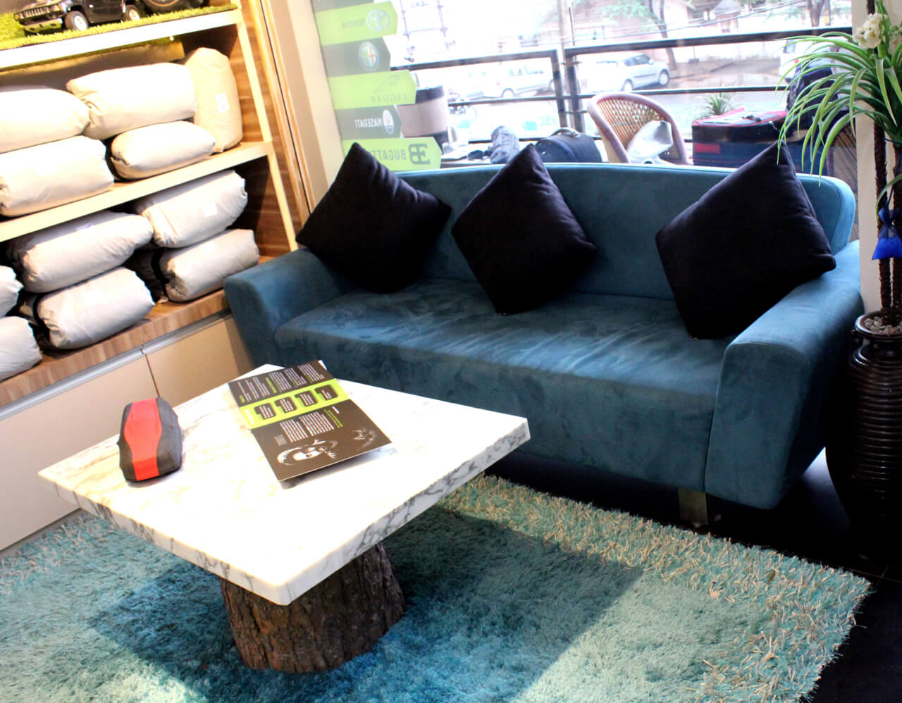
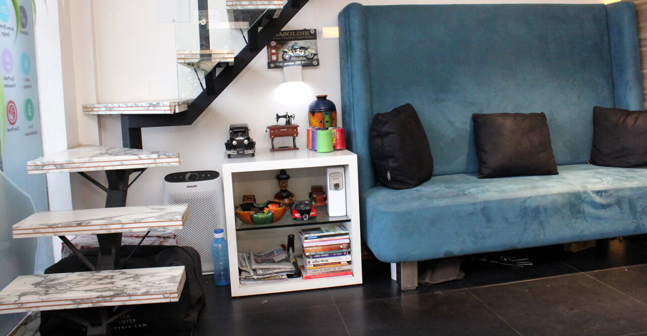
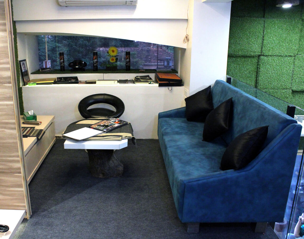
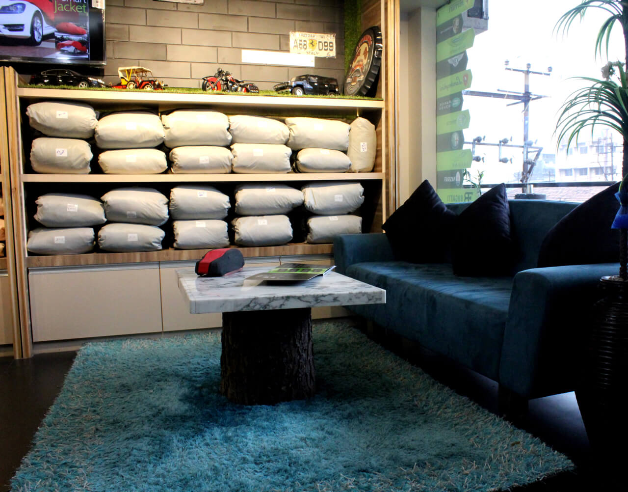
Walls have been treated with marine MDF with brick pattern and black PU coat. Sofa on the right hand side of the entrance with green shimmer upholstery gives the space an attractive look and feel. The top portion of the table placed in front of the sofa has been decked up with G4 finish. Other furniture added to the space is side table with open drawers arranged near the left side of the wall apart from pine colour rug on the floor.
As we designed the office on site, we didn’t face any challenges while executing the project. We discussed the layout with the open theme and took things forward on the site.
Could you give us details on the different units in the office?
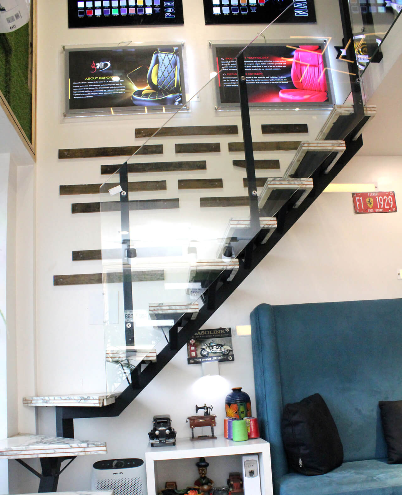
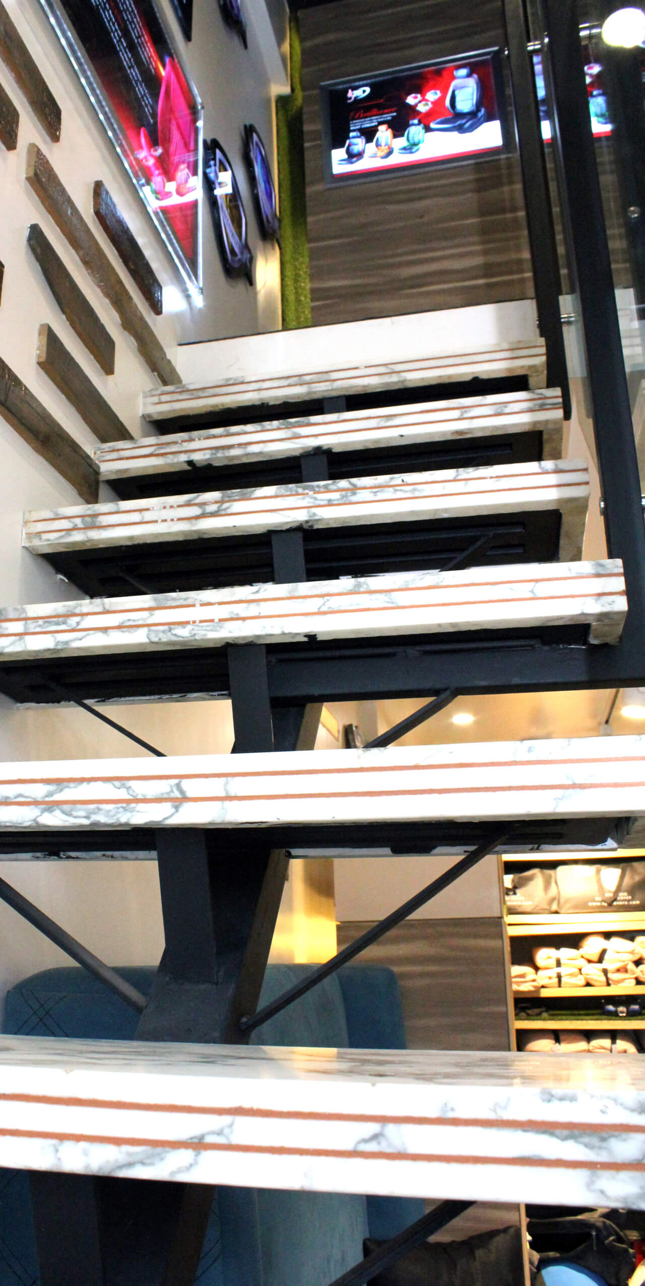
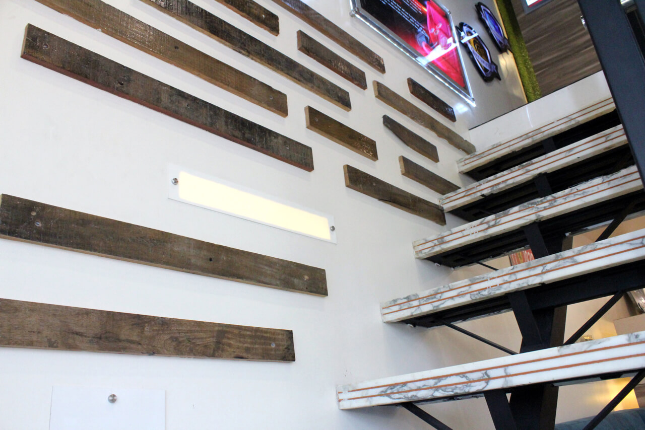
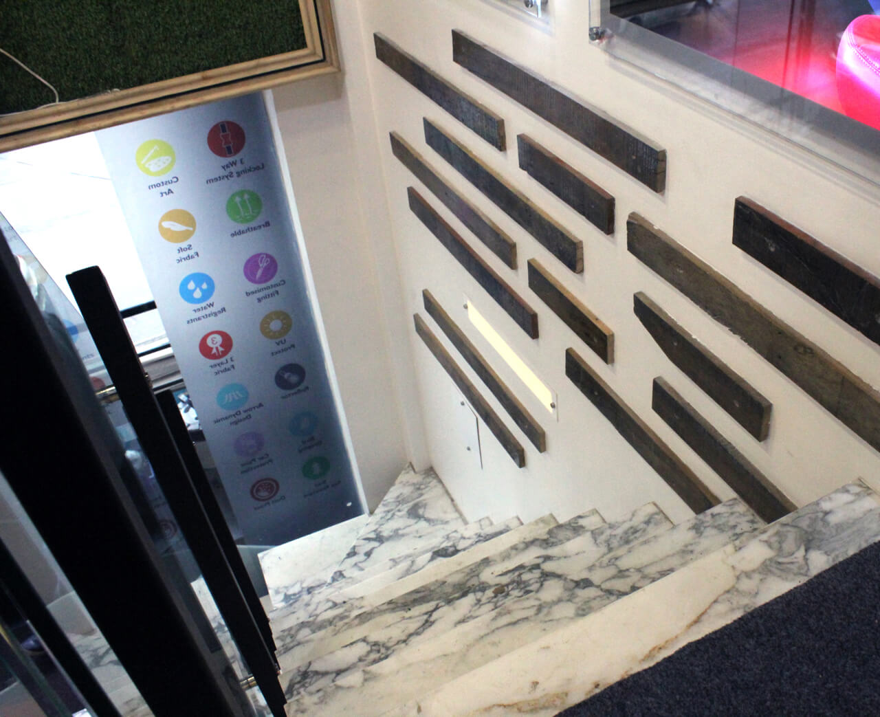
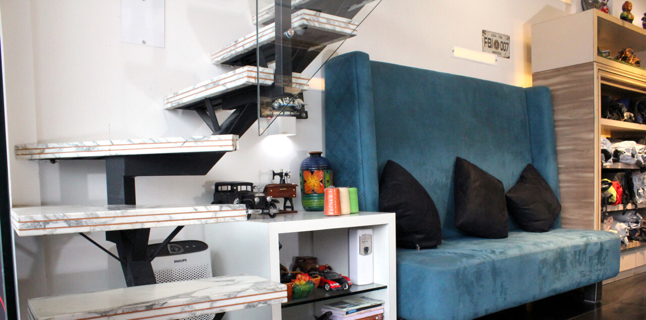
The entire space has been divided into two floors with a height of 15 feet. Italian marble staircase connects these floors seamlessly. As far as the colour scheme is concerned, black colour was selected for the ceiling on the top floor and white was used for the ground floor ceiling whereas black was used for the flooring in one of the sections.
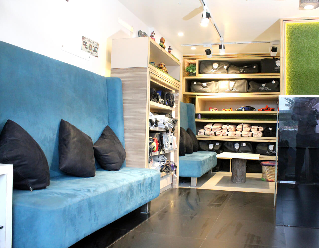
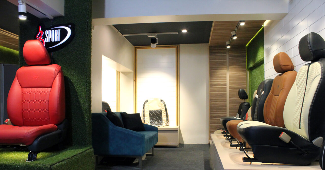
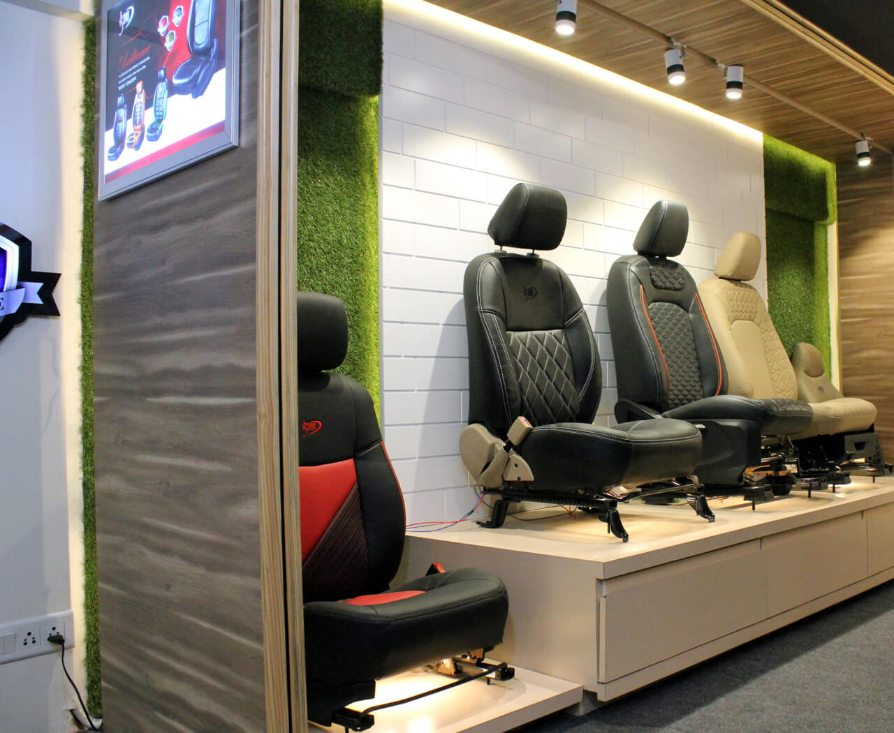
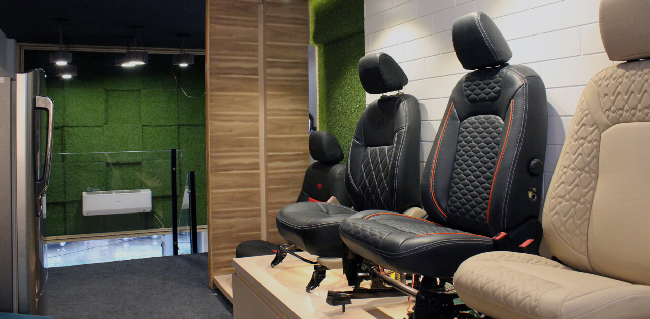
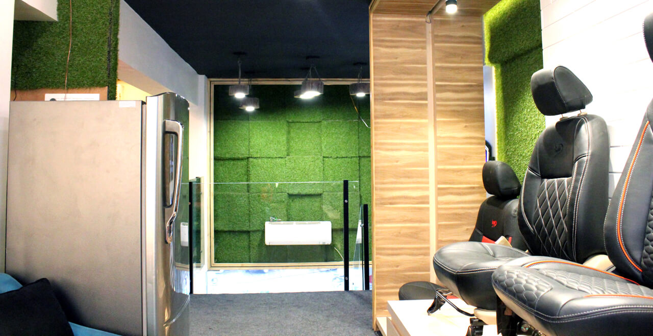
Tree branch with backlit frame on the left side staircase wall enhances the stairway beautifully. Similarly, artificial grass with up down panelling has been used on the wall above the entrance. The display of the seat cover has been arranged on the top floor whereas the ground floor has the bike and car cover unit. On the left hand side of the top floor, you will find the car seat demo unit with backlit feature. Mirror segregates this unit into two areas with a waiting area accommodated on the other side with a television unit displaying the presentation of the company’s recent product offerings and a table apart from sofa for three people.
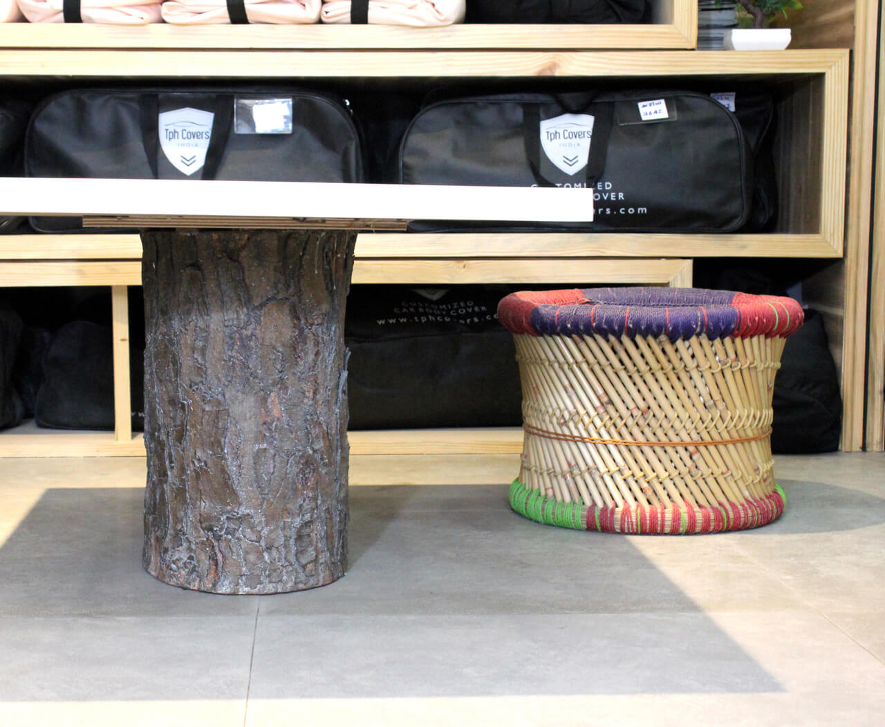
We designed another unit dedicated to bike covers. In this space, there is a sofa that can accommodate three individuals apart from a table. Italian marble flooring and glass partition in the cabin ensures visibility to different areas in the space.

What are the different features used to enhance the cash counter?
For the cash counter, we have used black back painted glass with G4 white border on the top. Similarly, the back wall has artificial grass with back lit logo of the company.
Was there any suggestion given to the client to help them improve productivity?
We recommended the client to use the television presentation. Another idea we gave them was to use technology and create an app with client customized seat with car cover and suggested to leave a tab on the client’s end for their convenience. The client did not work on these features as it would incur additional expense.
