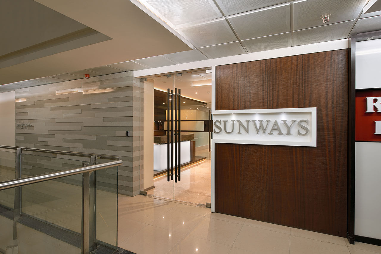
Office space demand separate areas for executive and other staff. Arrivae gets in touch with expert to understand the importance of office layout and its impact on the flow of the workplace.
Architect Keyur Asarawala
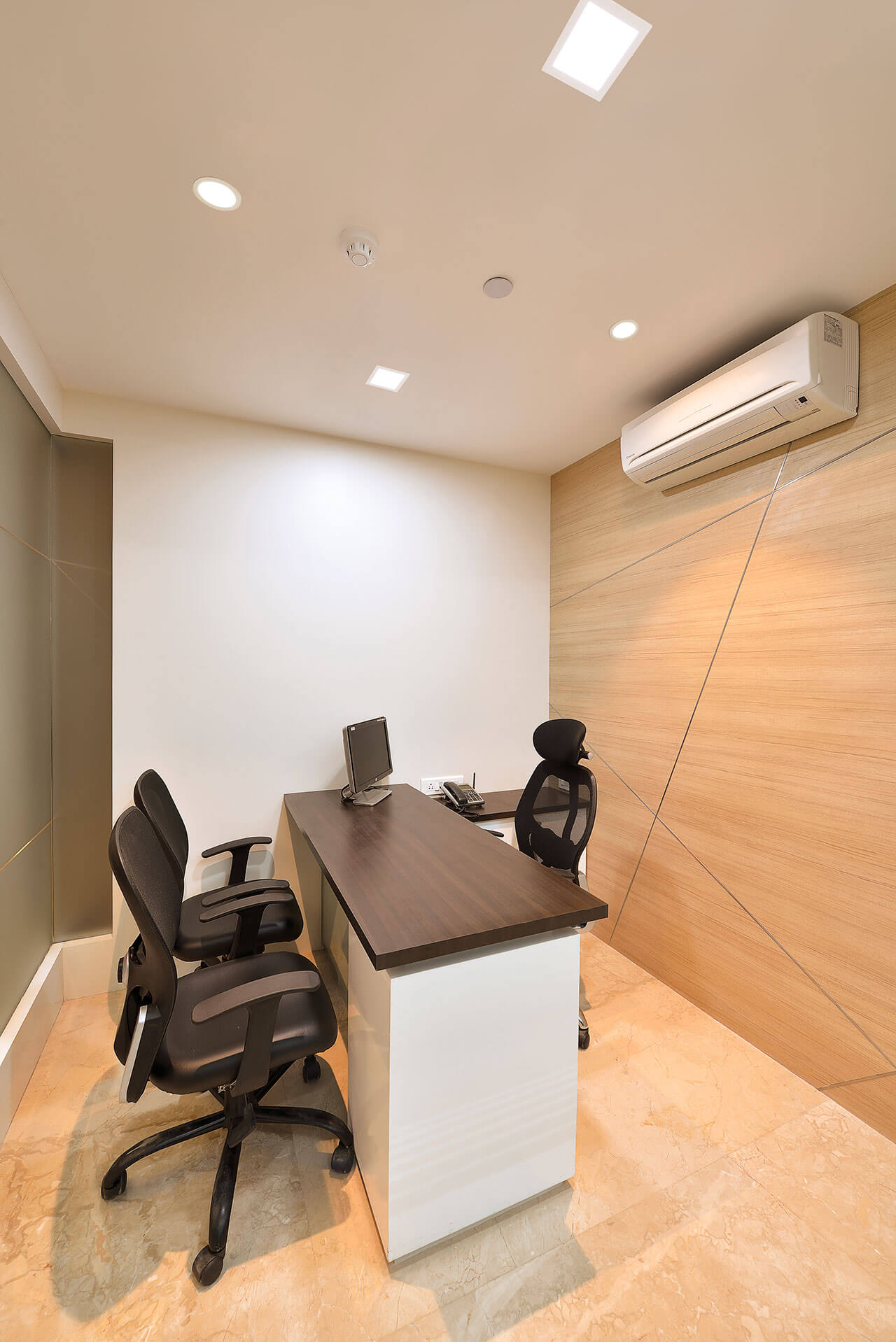
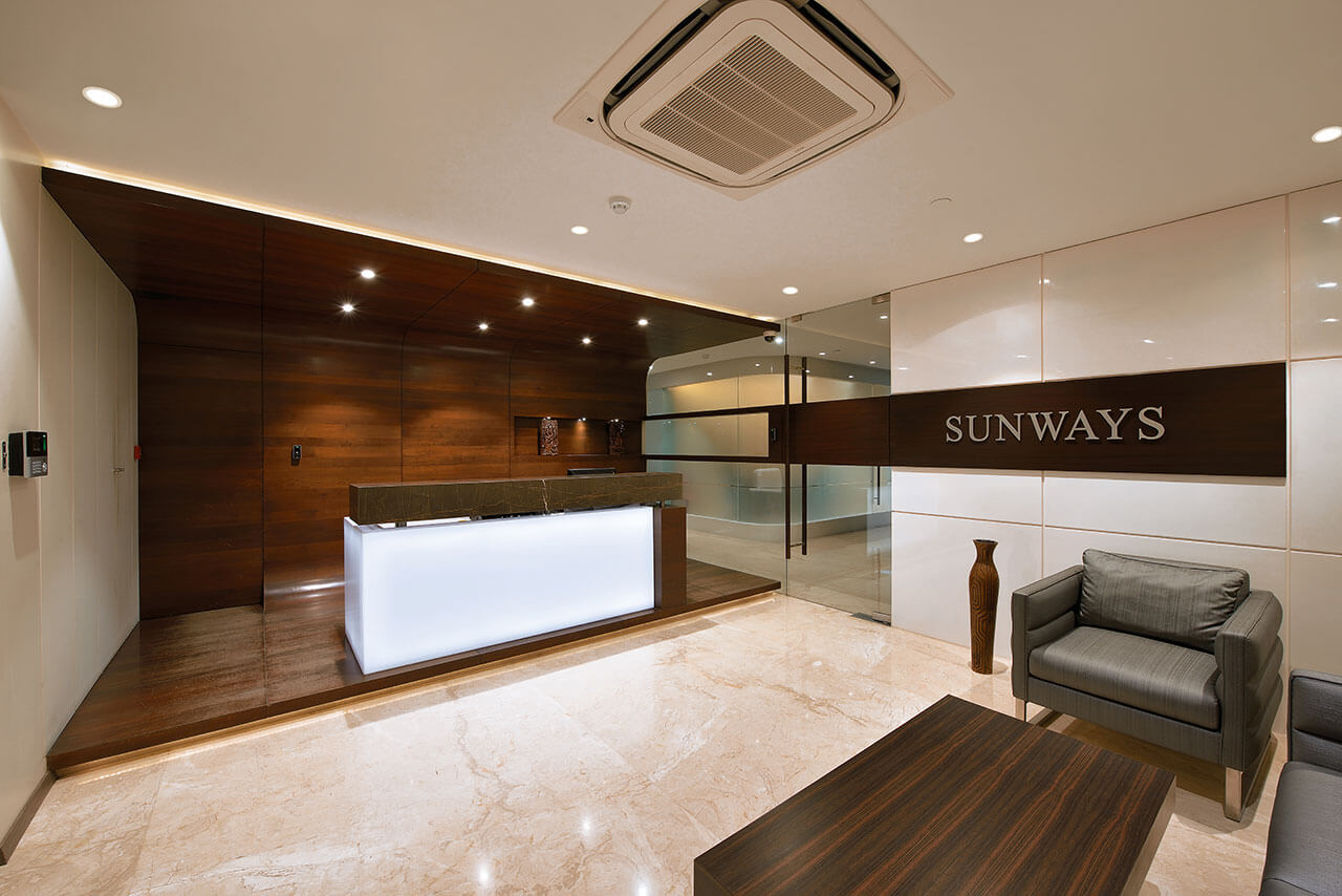
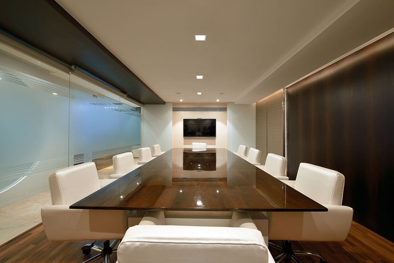
Client Expectation: Accommodate a total staff of 35 inclusive of 3 directors, 3 executive directors, 3 associates, apart from a big conference room for 14 people, small meeting room, small cabin for account heads, reception, pantry, storage space and lunch area for Sunways India Pvt. Ltd. a pharmaceutical company (6, 500 sq. ft.) in Andheri.
Uniquely Yours Solution: To ensure privacy for the executive level staff was maintained at all times, made it a point to keep the common space used by staff at a distance so that it did not disturb their work or interaction. The space was designed in such a way that top level executives had their privacy and guests visit did not distract the flow of work in the office. The client was very happy with the end result and the design garnered appreciation from their Japanese counterpart as well.
How did you plan the layout of the office?
The client believed in Vastu and wanted the office design according to the specifications of Vastu. To ensure the office space had all the functional elements in place, lot of thought went into planning the space without compromising on the space element and overcame the challenge using design skills. As Vastu required specific location designated for different tasks as specified by the Vastu consultant, we carefully designed the office space keeping all the necessary aspects of Vastu and client and space demands.
Did you face any major challenge?
For a commercial property, the space did not have much height. We kept this aspect in mind and height was kept to its maximum. This gave the space an open look and feel. Planning the flow of space was the only challenge we faced.
What steps did you take to give the office a stylish and modern appeal?
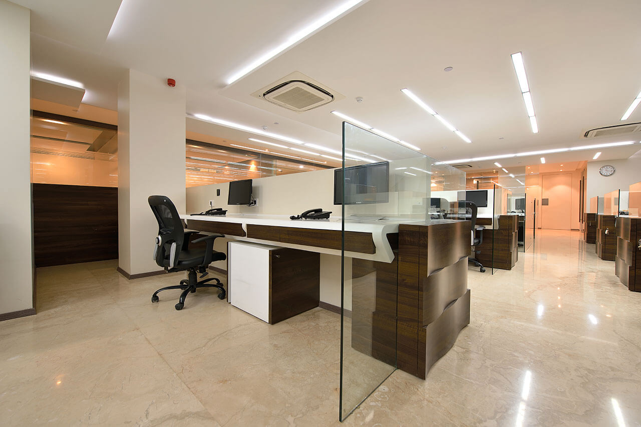
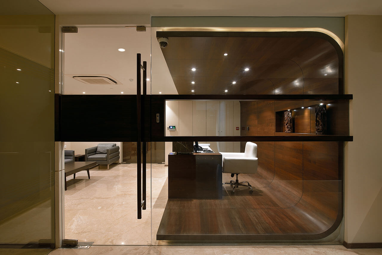
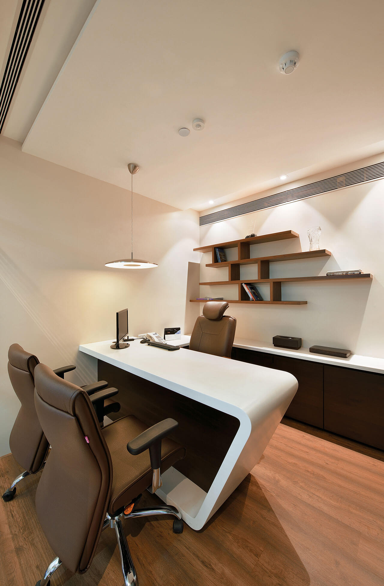
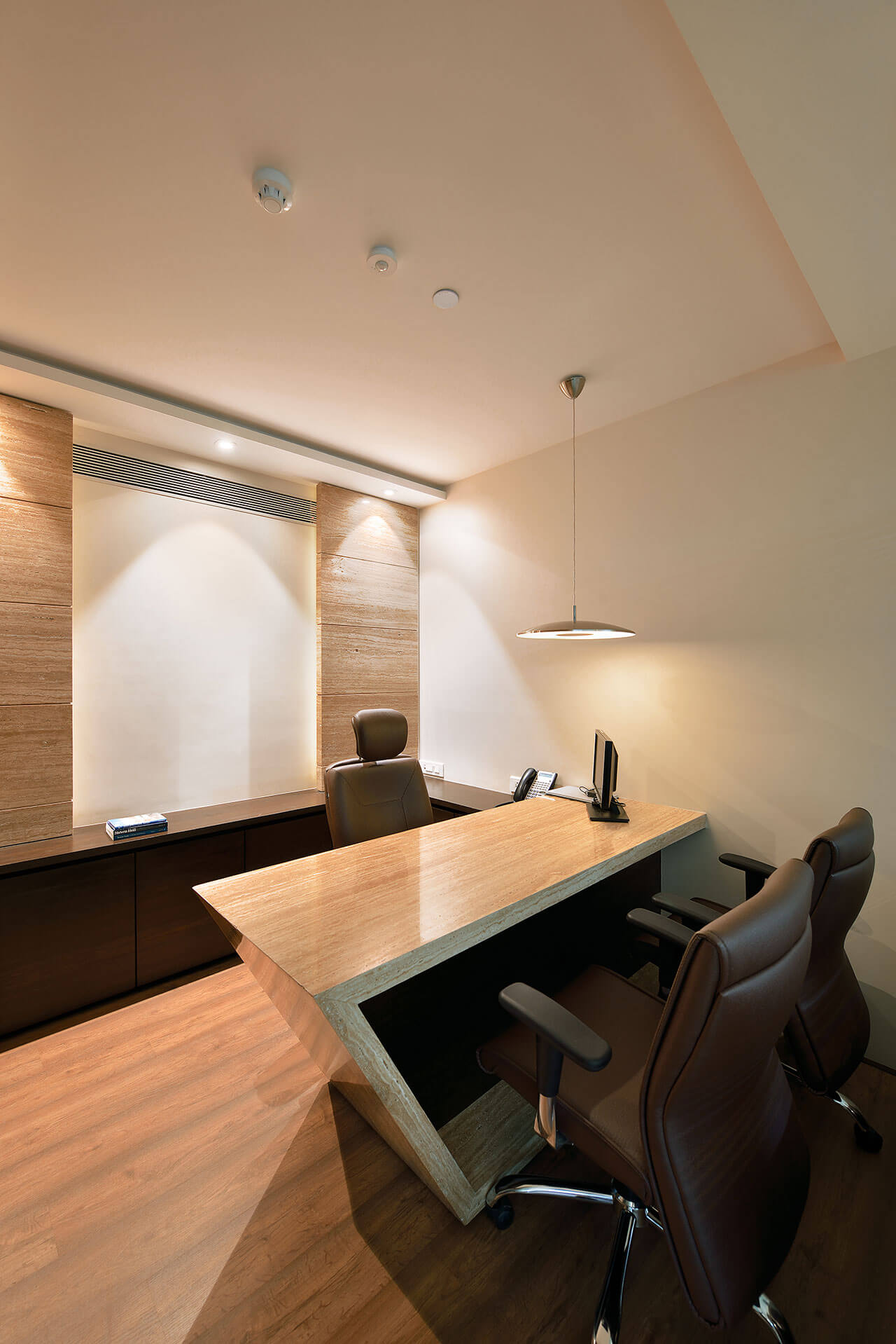
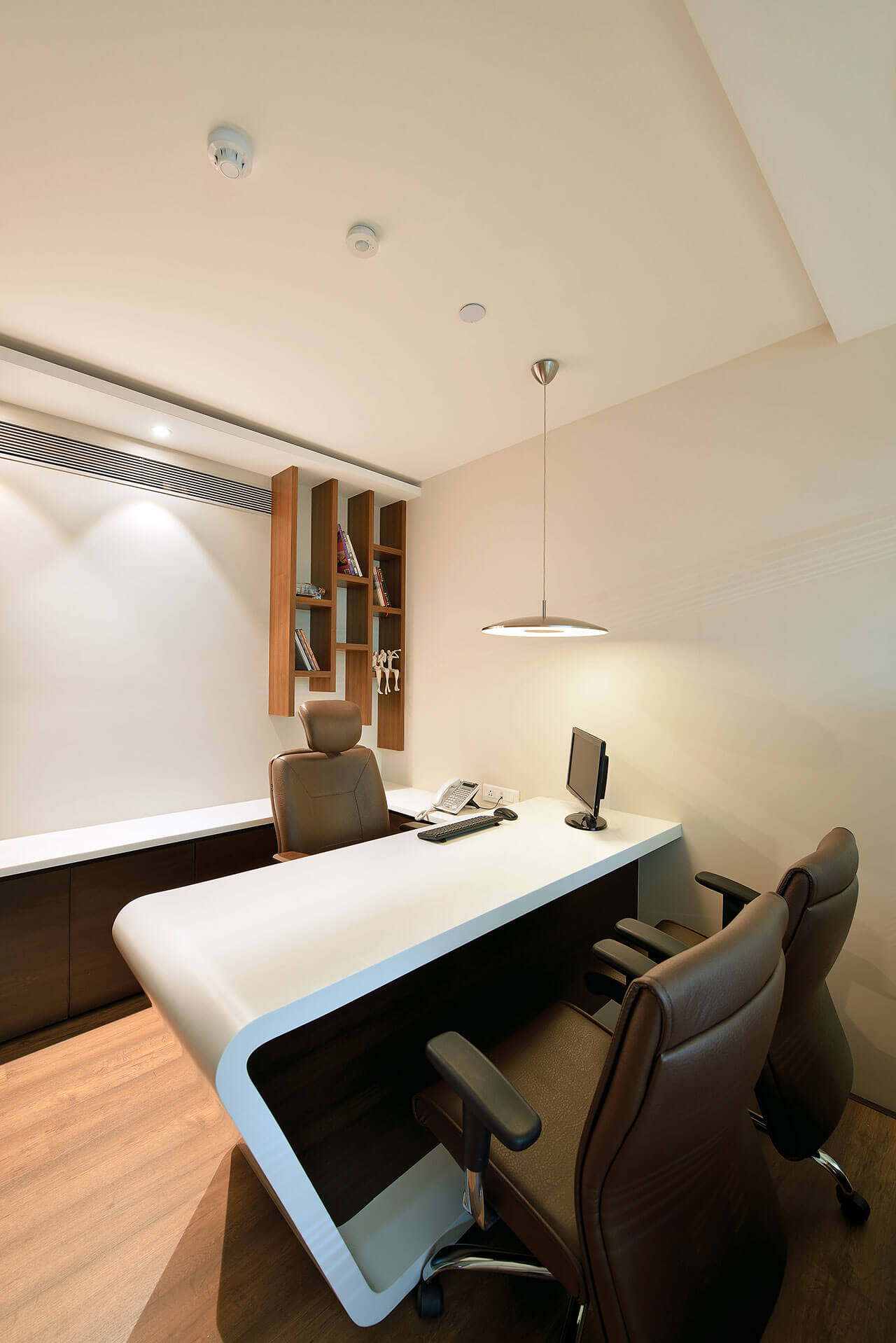
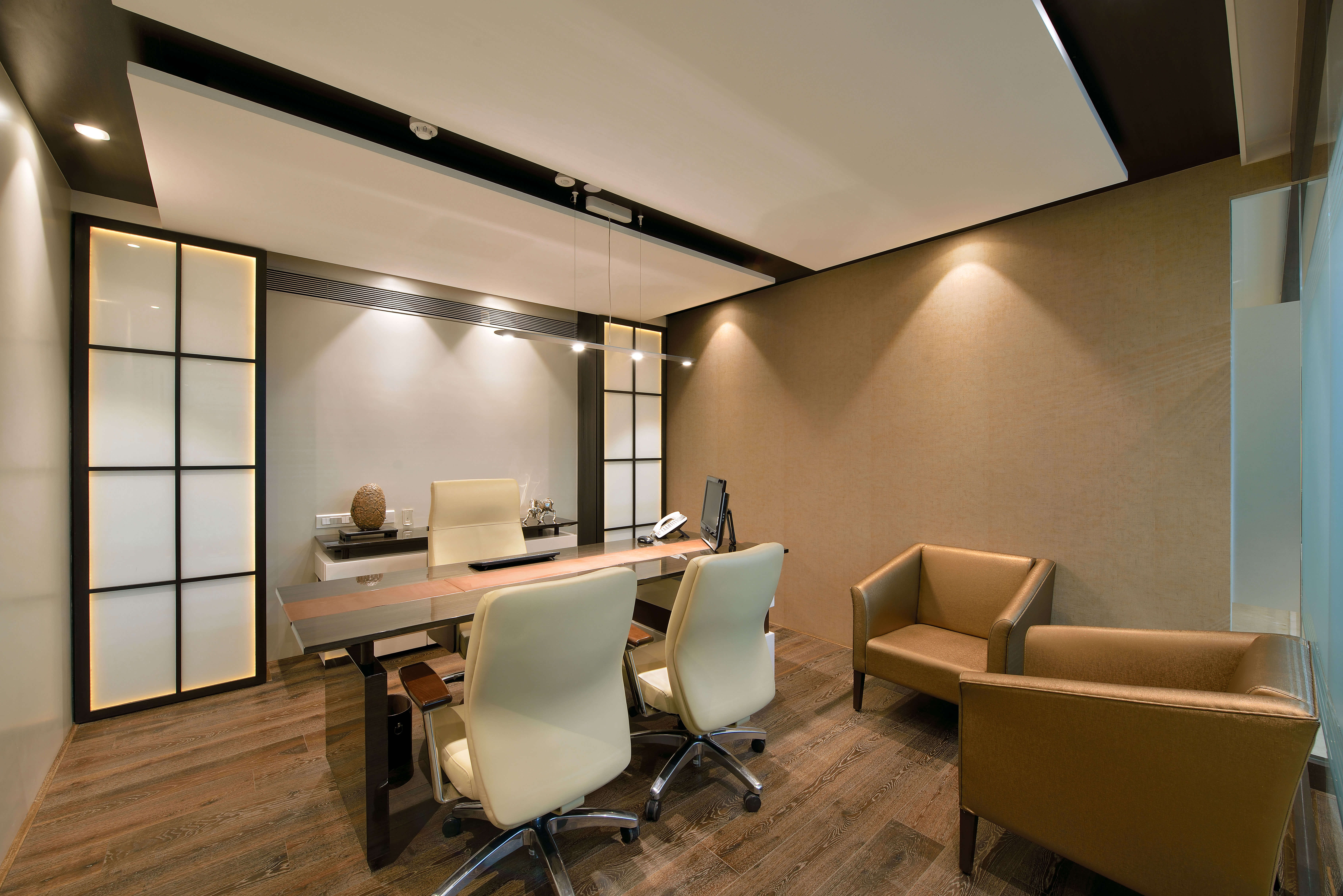
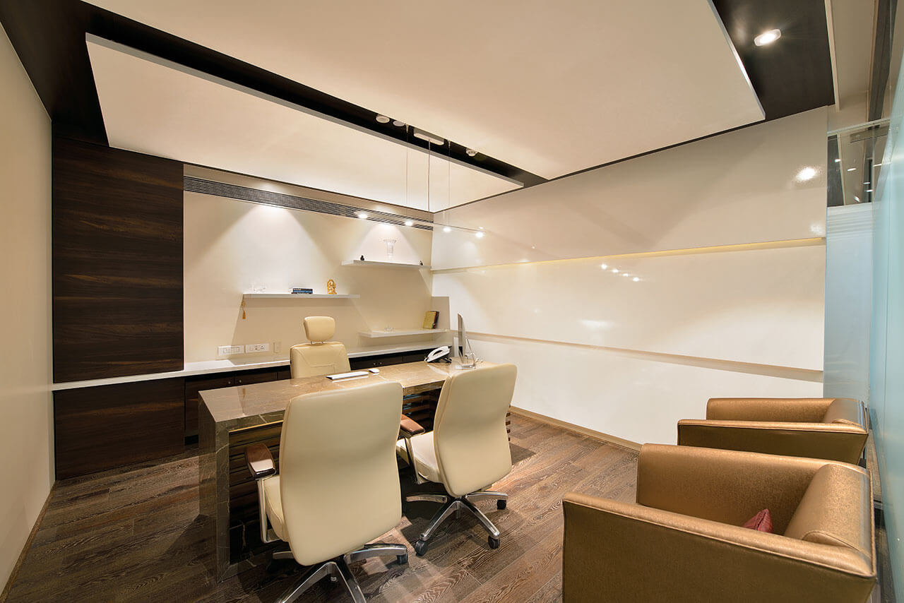
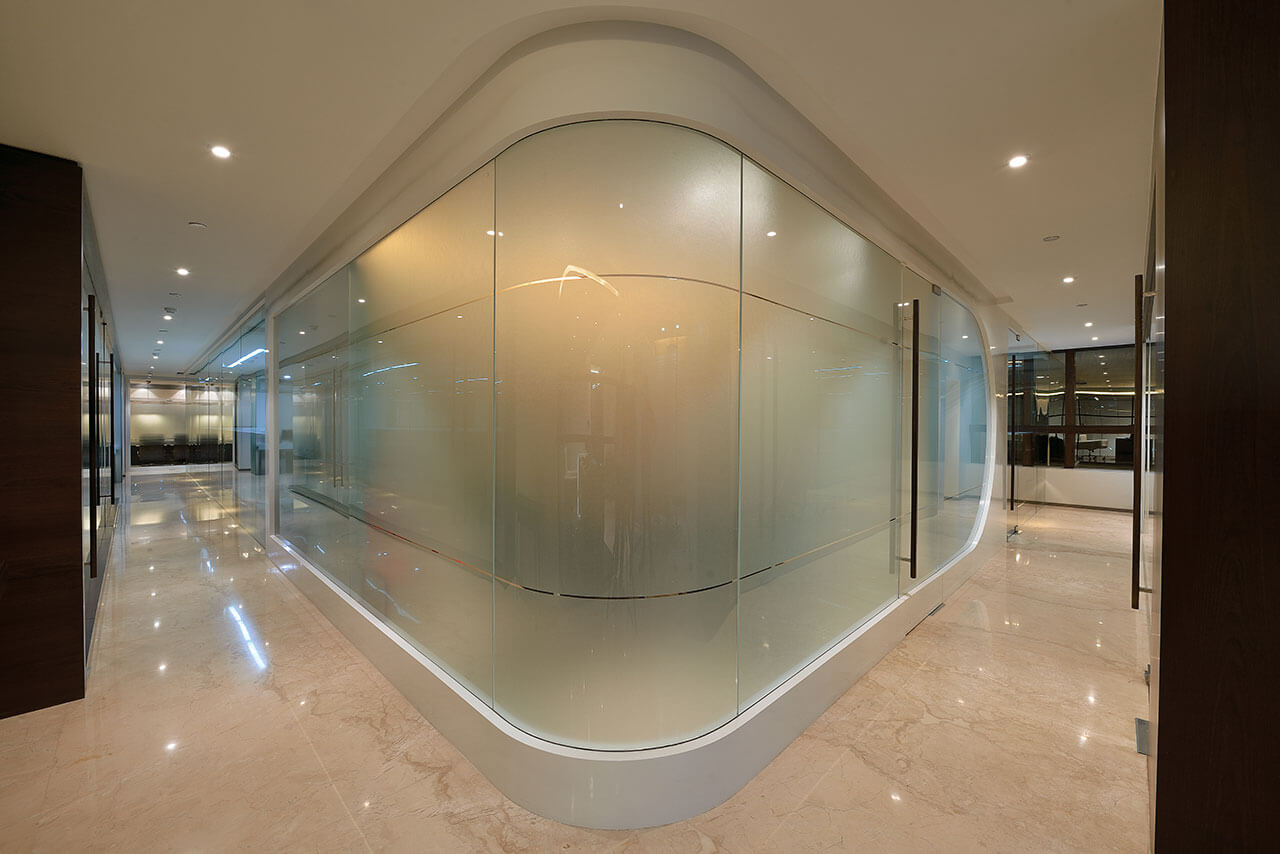
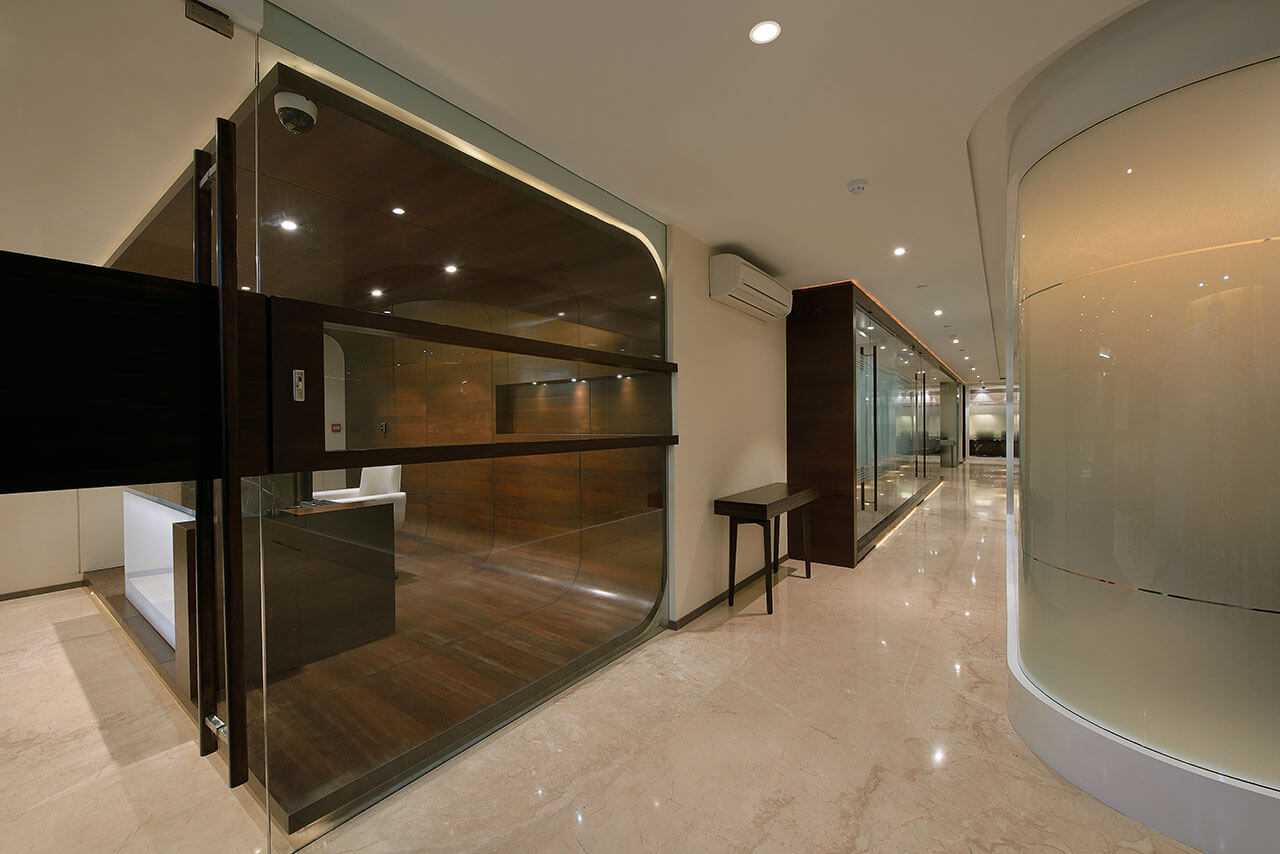
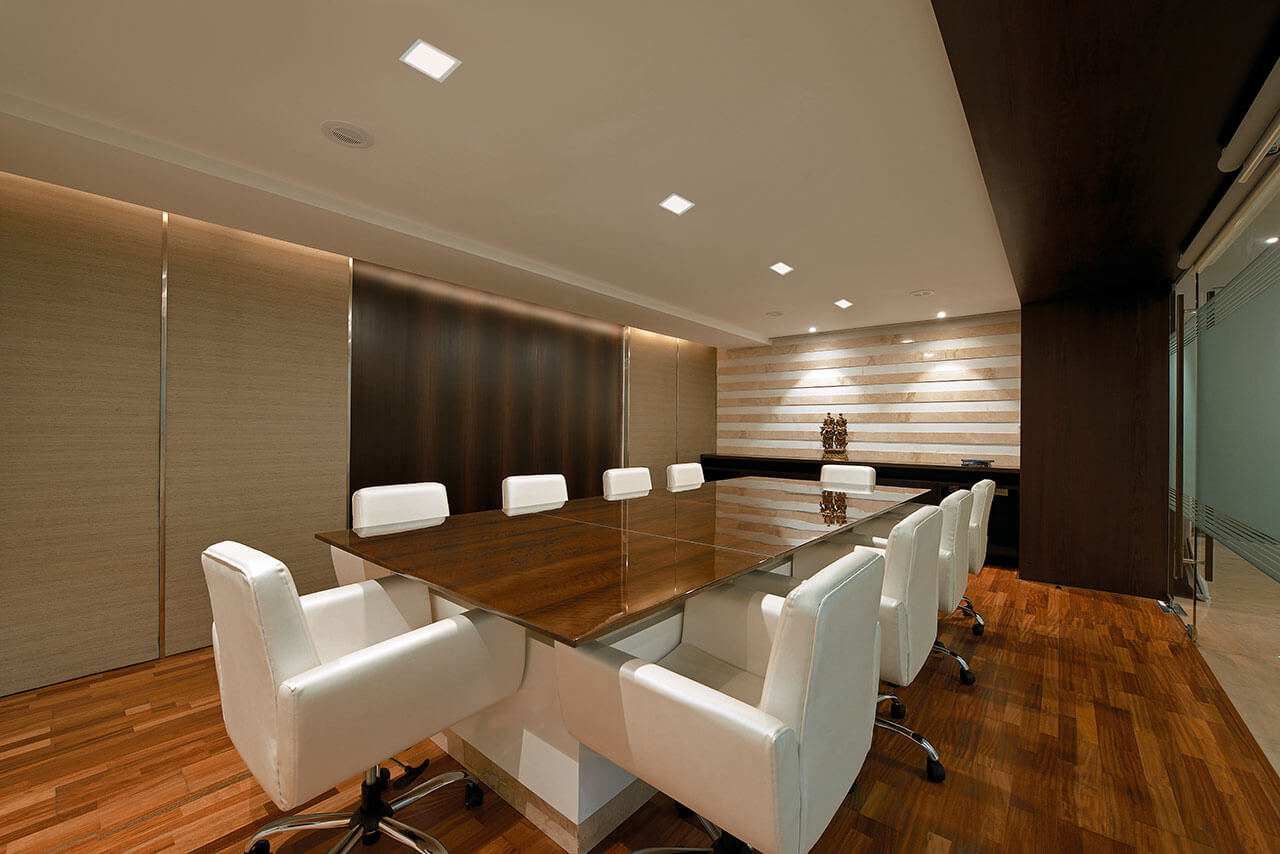
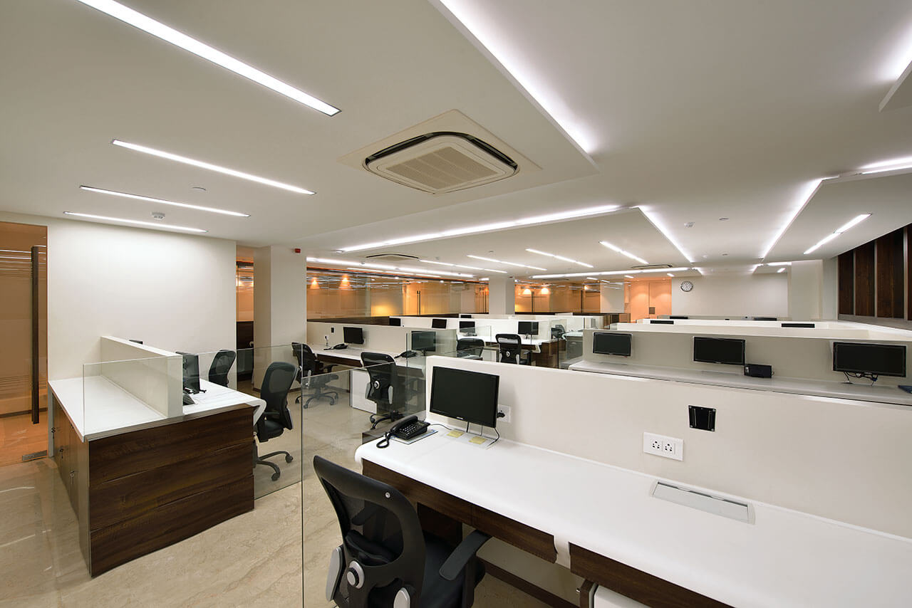
The office space was designed with white countertops and had a unique shape that made the edges invisible. The workstation was separated with clear glass. Storage space was adequately placed near the workstations to ensure there was no pile up of files etc. Ceiling heights were pushed to the brim to give it a visual appeal. The height of the workspace was concealed in the ceiling. For openness, we used grey and brown colour scheme and glass for partitions. The countertop was made of Corian and marble was used for the flooring of the workspace, excluding the executive area that was enhanced with natural wooden flooring. In line with the requirements of the client to incorporate natural elements, we used a combination of wood and veneer.
Would you like to talk about any unique feature used in this project?
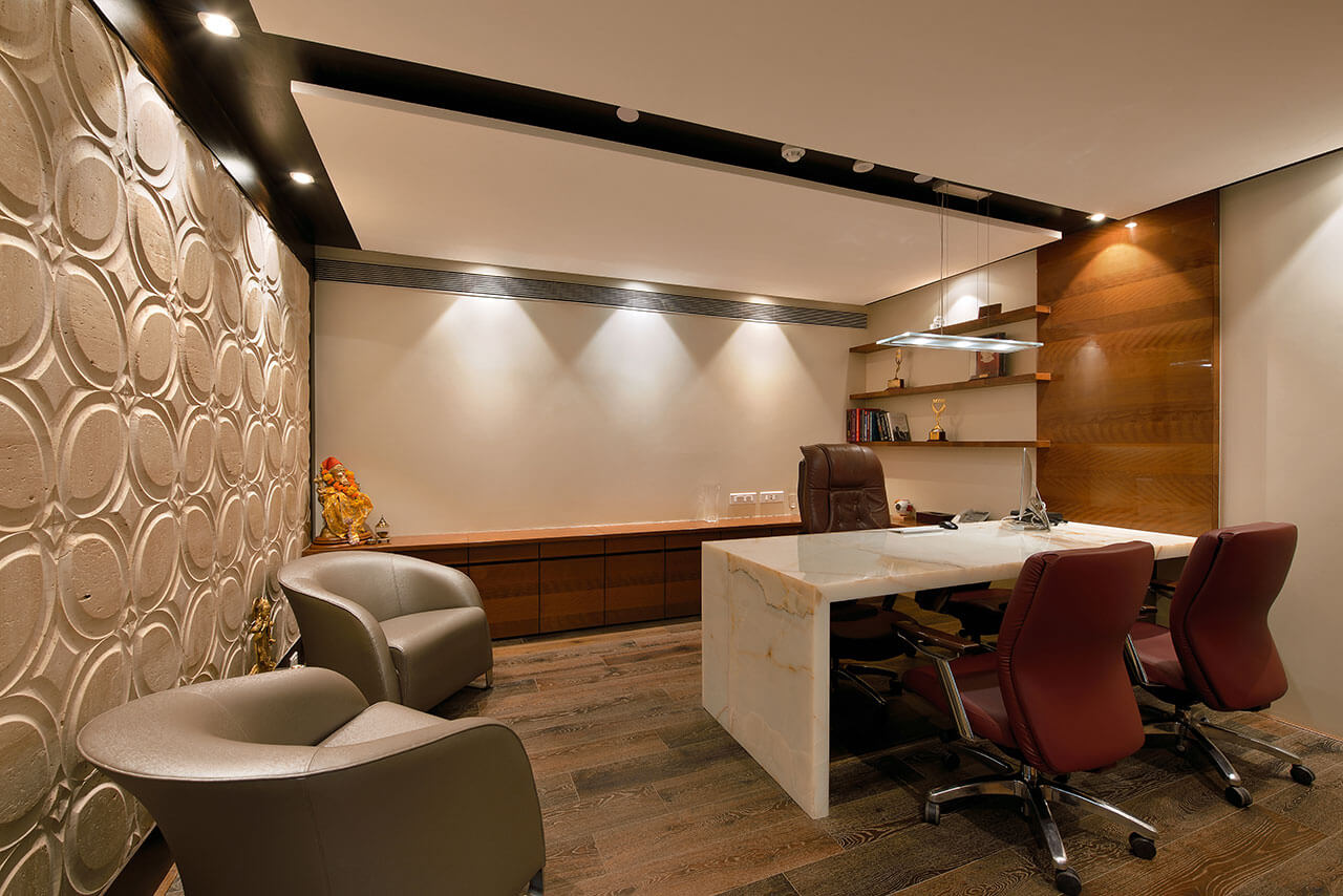
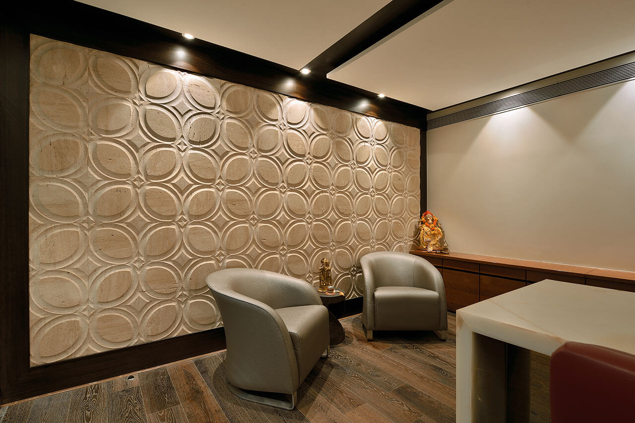
The director’s cabin was designed keeping in mind their individual preference. In keeping with the persona of the MD, onyx marble was used on the tabletop, apart from hanging lights and decorative marble, lacquered wooden panel was used on the wall to tie in the entire office look.
