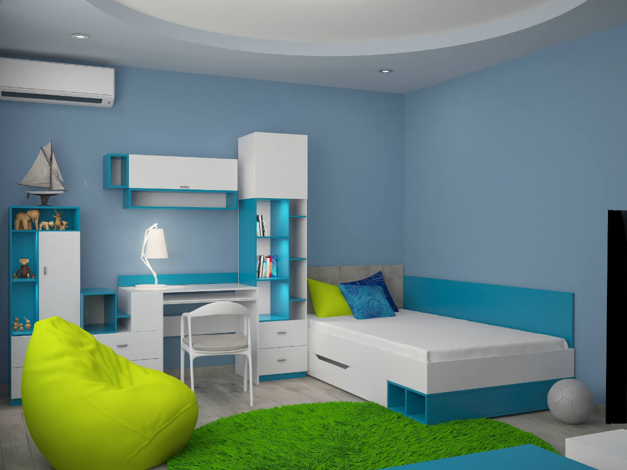
Colours add visual interest to a kid’s space. Arrivae takes a look at the design and colour scheme apart from the storage aspect that can be made colourful supported by expert inputs.
Client Expectation: Mr. Shroff in Juhu desired more free area on the floor to play and a kid-friendly design catering to the requirements of the kid.
Uniquely Yours Solution: Provided lot of storage to cater to a boy (4 – 5 years) and a newborn.
Architect Abhay Patil
What were the different elements taken care of to make the space engaging for the client’s two kids?
Mr. Shroff wanted a lot of storage for his kids. The older kid around five years old was very notorious. So we created lot of storage to cater to the requirements of the kid. Floor space was kept open to ensure the kid can move around freely and appropriate furniture was added to the kid’s space. We used one wall to accommodate a bunk bed and another wall was used to create open storage. There is also open storage given to store the kid’s accessories like sporting tool. The main highlight of the space was the flexible design of the shelf as it could be moved up and down to store toys and accessories. As the kid’s interest and activity pattern tend to change as they grow, it became essential to keep the design flexible to meet these changing requirements.

Could you throw some light on the factors to be kept in mind for the kid’s area?
Kids grow fast and we had to create a futuristic design for the kid’s room in such a way that it could be used when the kid grows up as well. Safety is another important aspect to be kept in mind while designing the kid’s space. As kids tend to move around most of the time, we designed the space sensitively and ensured there are no sharp edges for the furniture like bunk bed etc. Stairs were also fabricated with no edges reiterating the safety aspect. To keep distractions at bay, Mr. Shroff did not want any television points. This aspect was important as the kid would be encouraged to play outdoors. Bunk bed also allows more space to free up on the floor for the kid to play indoors if required.
How did you illuminate the kid’s area?
We gave task and mood lighting comprising of cove, direct and a lot of hanging lights that was kept out of the reach of the kid. To brighten up the space, the entire wall storage with flexible shelf was decked up with shades of pastel colours like blue, green and yellow. This gives an energetic feel to the space as well.
Tell us about the different décor used in the space?
The two BHK sea-facing house had one bedroom (around 150 sq. ft) for the kids. Bright hues dominate the kid’s area. You will find bright colour tiles used in the kid’s bathroom apart from white and red colours used for the flooring. To add a decorative touch to the space, we have given a fish pond design on the walls. One side of the wall in the washroom has an imprint of the fish tank.

