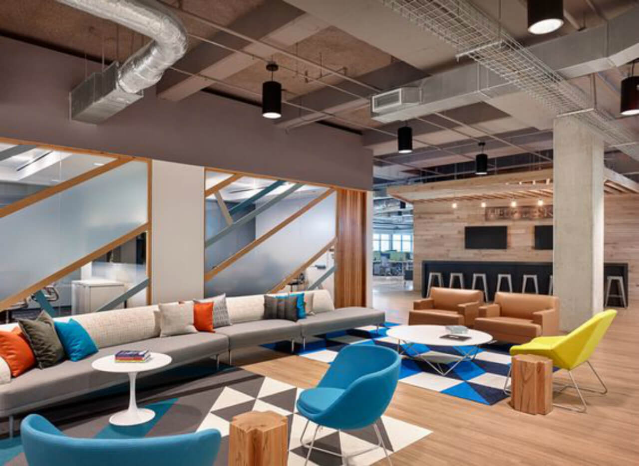
Subtle and sober touch is clearly the game changer as far as the open theme is concerned. Arrivae gets in touch with expert to highlight the features of this style and understand the flexibility that this theme offers.
Client Expectation: Ambavat Jain & Associates desired an open office design with conference room, two cabins, staff and reception area apart from the server room and pantry.
Uniquely Yours Solution: Executed the project with the open office theme and subtle colour scheme.
Amit Kolar
How did you achieve the open office theme as desired by Ambavat Jain & Associates?
To give the office area an open and airy appearance, we used glass partitions. The advantage of using glass partitions was that when you stood at the entrance, all the corners of the office would be visible from here. As far as colour scheme was concerned, we used wooden finishes to give a natural touch to the space. Reiterating the open office theme further, the walls were painted white. Combination of wood and glass has been used for the office cabins which meant that the partition was decked up with glass from front and wood from behind. For the open office theme in the reception area, we used half wooden partition behind and created a small area to sit that could be occupied by staff or visitors. This was a small open space that could be accommodated by anyone.

What kind of storage was provided for the staff?
We provided lockable drawers to the staff so that their files and other important documents could be kept securely in them. File cabinets were given at the sides of the wall. This again ensured that the space looked uncluttered and neat.
What was the safety measures kept in mind for the office?
Adhering to the safety norms of an office space, there was fire extinguishers put in place. Battery backup in the server room was another preventive measure taken care of.
Could you highlight the décor aspect of the office?
Since the client wanted a subtle look and feel for the office, we did not experiment much in the décor department. To deck up the partner’s cabin and conference room, we used wallpaper with simple geometric design. In the partner’s cabin, we used paneling and wooden ceiling behind the idol. The other partner did not desire to occupy the cabin for longer period of time. Therefore the design was kept simple in this cabin.
Did you face any major hurdle while executing the office project?
Budget was one of the challenges we faced as the client was unwilling to spend much. Managing to accommodate 20 – 25 staff, conference room for six people, reception area, waiting area, two partner cabins, one pantry and attached server room in the office space comprising of 1,000 sq. ft. was another aspect we had to take care of. All these were executed with proper planning and incorporating appropriate design suitable to achieve the open office theme.

